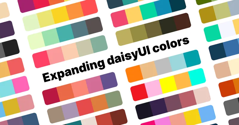
Updates, ideas and resources
How to add a new color to daisyUI themes
Do you want to add new color names to daisyUI color palette? Here is how you can do it.
daisyUI provides semantic color names. These color names are used in all daisyUI components and the can have different values in different themes.
The problem with constant color names
Using Tailwind CSS color names, you should use constant color names for everything. For example, to set a light background and dark text we you have to use bg-white text-black and then again for a dark mode, you would have to set dark:bg-black dark:text-white
That is not efficient because not only you should use more class names for each element to set the colors, having a dark mode would require you to decide on the colors for each element again. Imaging how hard it would be to add more themes to your project.
Solution: Semantic color names and CSS variables
daisyUI solves this problem by providing semantic color names. For example, you can use bg-base-100 text-base-content and then set the background and foreground colors.That's it. It would be dark color on a light background when you use a light theme, It would be light color on a dark background when a dark theme is used.
daisyUI semantic color names (base, primary, etc) are using CSS variables for the color values. So you can easily change the theme of your entire site by changing the value of these variables.
You can also have multiple themes at the same time without adding a single class name. Light mode, dark mode, or any other theme you want.
These are the daisyUI color names: 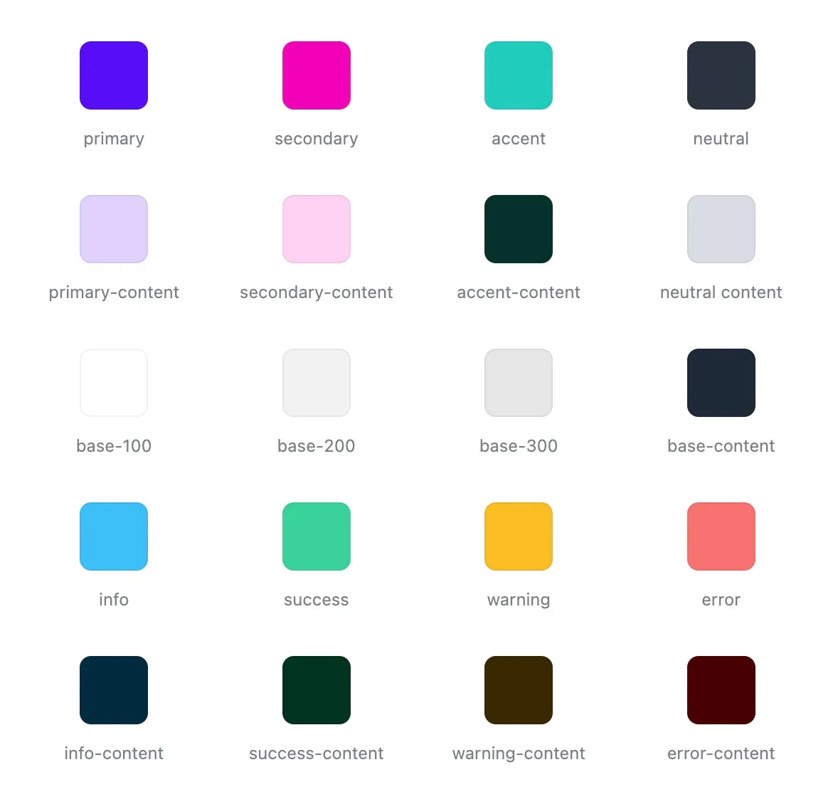 Read more about daisyUI color system and daisyUI themes
How using a color palette can help
In a design system, you should have a color palette. A color palette is a set of colors that you use in your design system. This helps you to have a consistent look and feel across your entire site. A common practice is to have:
- A set of brand colors (
primary,secondary,accent) - A set of state colors (
success,info,warning,error) - A set of neutral colors for the background and content
These names are enough for almost all design systems. Most successful design even need less colors. More than that would make the design complicated for the users and also for the developers.
How to add new colors to daisyUI themes
However just because daisyUI is offering these color names, it doesn't mean you're limited to these colors. You can add new color names and use them in daisyUI themes.
daisyUI has primary and primary-content but let's say you need a new shade of your primary color.
Step 1
Let's add a new color called primary-muted to Tailwind CSS
This allows us to use this new color name with all Tailwind CSS color utilities. For example, bg-primary-muted would set the background color to the new color.
bg-primary-muted utility class will set the background color to green by default.
@import "tailwindcss";
@plugin "daisyui"{
  themes: light --default, dark --prefersdark;
}

+ @theme{
+   --color-primary-muted: green;
+ }
Step 2
Let's use the new primary-muted color in daisyUI light and dark themes.
bg-primary-muted utility class will set the background color to red in the light theme and blue in the dark theme.
@import "tailwindcss";
@plugin "daisyui"{
  themes: light --default, dark --prefersdark;
}

@theme{
  --color-primary-muted: green;
}

+ @plugin "daisyui/theme" {
+   name: "light";
+   --color-primary-muted: red;
+ }
+ @plugin "daisyui/theme" {
+   name: "dark";
+   --color-primary-muted: blue;
+ }
Now you can simply use bg-primary-muted (or other Tailwind CSS color utilities) wherever you want and it will have different colors on each theme.
To see the result, use this HTML code:
<div class="bg-primary-muted">
  This div will have green background by default
</div>

<div data-theme="light" class="bg-primary-muted">
  This div will have red background in light theme
</div>

<div data-theme="dark" class="bg-primary-muted">
  This div will have blue background in dark theme
</div>