All daisyUI components
68 components
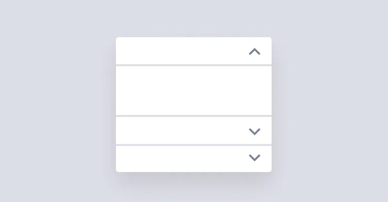
Accordion
Accordion is used for showing and hiding content but only one item can stay open at a time.

Alert
Alert informs users about important events.

Aura
Aura is a border light effect that can wrap around any component. It is a great way to add a cool, eye-catching visual effect to your components. Aura is useful for the most important button, card, or div that you want to highlight.
Avatar
Avatars are used to show a thumbnail representation of an individual or business in the interface.
Badge
Badges are used to inform the user of the status of specific data.
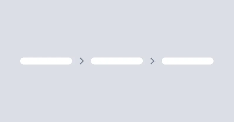
Breadcrumbs
Breadcrumbs helps users to navigate through the website.
Button
Buttons allow the user to take actions or make choices.
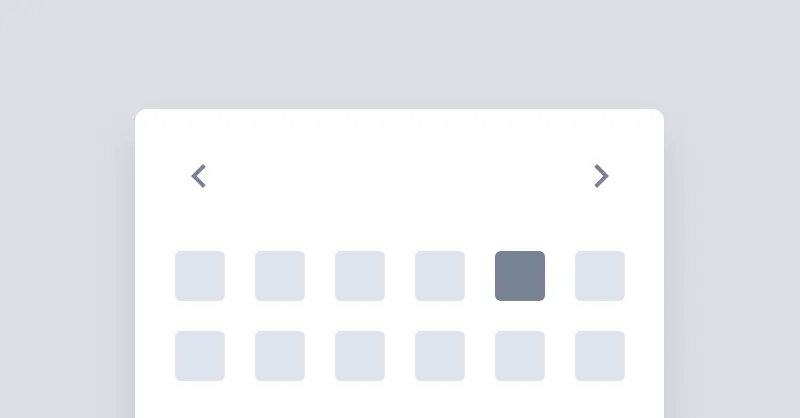
Calendar
Calendar includes styles for different calendar libraries.

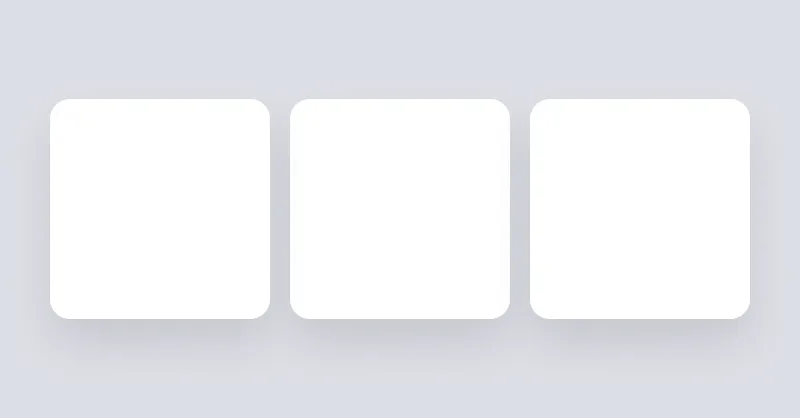
Card
Cards are used to group and display content in a way that is easily readable.
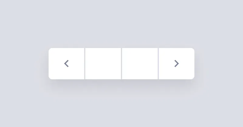
Carousel
Carousel show images or content in a scrollable area.

Chat bubble
Chat bubbles are used to show one line of conversation and all its data, including the author image, author name, time, etc.

Checkbox
Checkboxes are used to select or deselect a value.
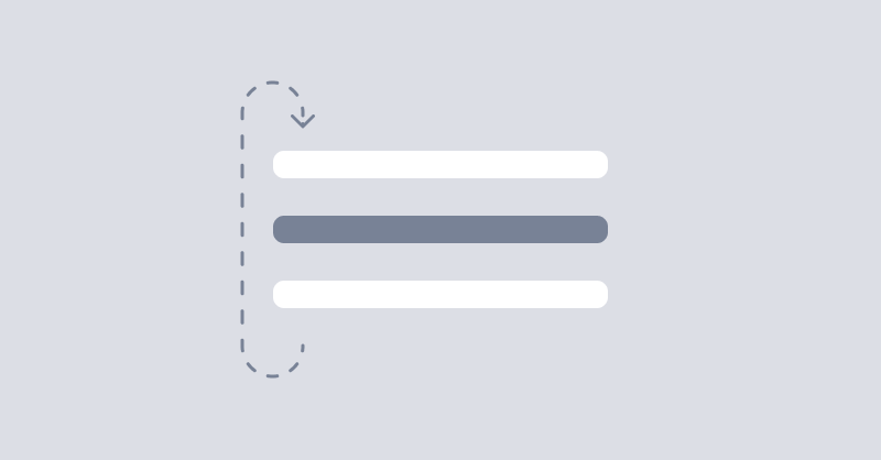
Collapse
Collapse is used for showing and hiding content.

Countdown
Countdown gives you a transition effect when you change a number between 0 to 999.
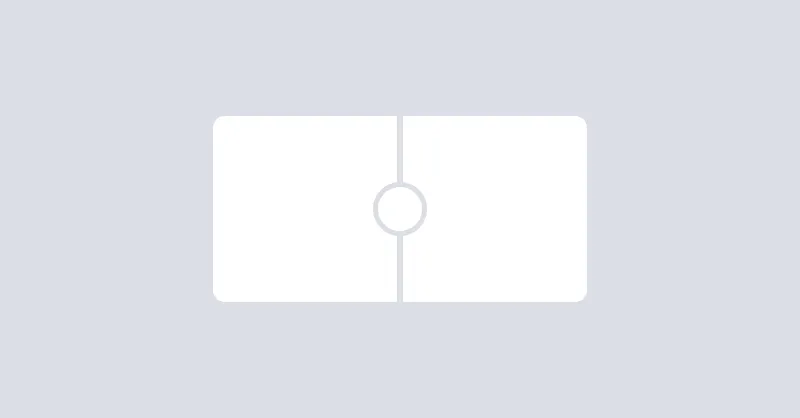
Diff
Diff component shows a side-by-side comparison of two items.
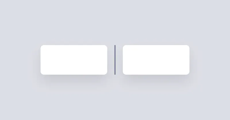
Divider
Divider will be used to separate content vertically or horizontally.

Dock
Dock (also know as Bottom navigation or Bottom bar) is a UI element that provides navigation options to the user. Dock sticks to the bottom of the screen.

Drawer sidebar
Drawer is a grid layout that can show/hide a sidebar on the left or right side of the page.
Dropdown
Dropdown can open a menu or any other element when the button is clicked.

FAB / Speed Dial
FAB (Floating Action Button) stays in the bottom corner of screen. It includes a focusable and accessible element with button role. Clicking or focusing it shows additional buttons (known as Speed Dial buttons) in a vertical arrangement or a flower shape (quarter circle).

Fieldset
Fieldset is a container for grouping related form elements. It includes fieldset-legend as a title and label as a description.
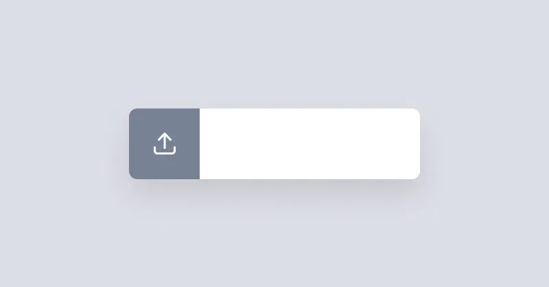
File Input
File Input is a an input field for uploading files.
Filter
Filter is a group of radio buttons. Choosing one of the options will hide the others and shows a reset button next to the chosen option.

Footer
Footer can contain logo, copyright notice, and links to other pages.

Hero
Hero is a component for displaying a large box or image with a title and description.

Hover 3D Card
Hover 3D is a wrapper component that adds a 3D hover effect to its content. When we hover over the component, it tilts and rotates based on the mouse position, creating an interactive 3D effect.
Hover Gallery
Hover Gallery is container of images. The first image is visible by default and when we hover it horizontally, other images show up. Hover Gallery is useful for product cards in ecommerce sites, portfolios or in image galleries. Hover Gallery can include up to 10 images.

Indicator
Indicators are used to place an element on the corner of another element.
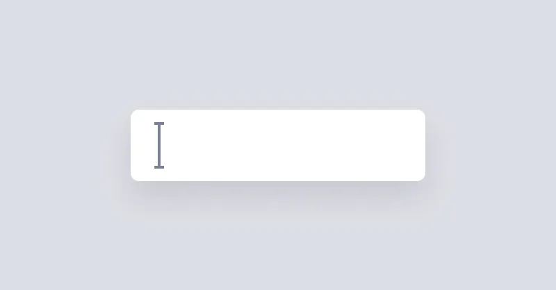
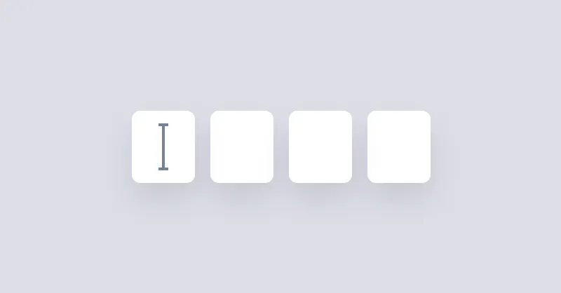
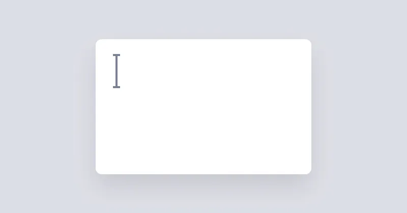
Text Input
Text Input is a simple input field.
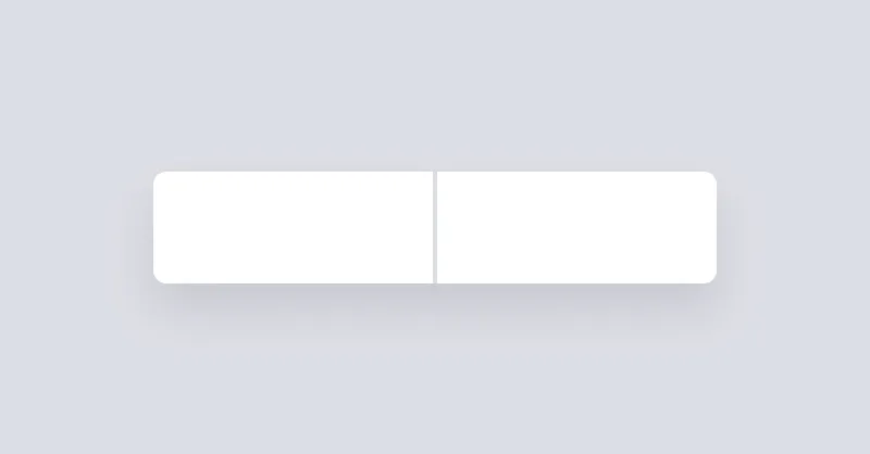
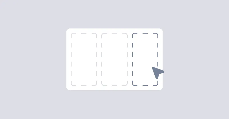
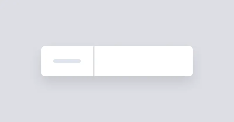
Join (group items)
Join is a container for grouping multiple items, it can be used to group buttons, inputs, etc. Join applies border radius to the first and last item. Join can be used to create a horizontal or vertical list of items.

Kbd
Kbd is used to display keyboard shortcuts.
Label
Label is used to provide a name or title for an input field. Label can be placed before or after the field.

Link
Link adds the missing underline style to links.
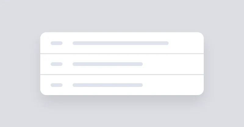
List
List is a vertical layout to display information in rows.

Loading
Loading shows an animation to indicate that something is loading.

Mask
Mask crops the content of the element to common shapes.

Megamenu
A megamenu is a large, horizontal menu where each item opens a popover to show a large block of navigation links. Megamenu must be used once, on top of the page. Inside each popover, you can use a daisyUI menu, or any custom content. Megamenu fits better on large screens only, and for small screens, you can hide the megamenu and show the content in a dropdown or a drawer.

Menu
Menu is used to display a list of links vertically or horizontally.
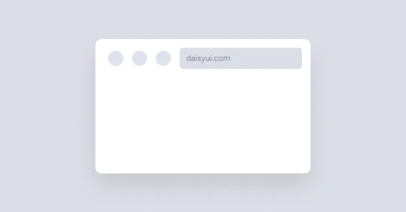
Browser mockup
Browser mockup shows a box that looks like a browser window.
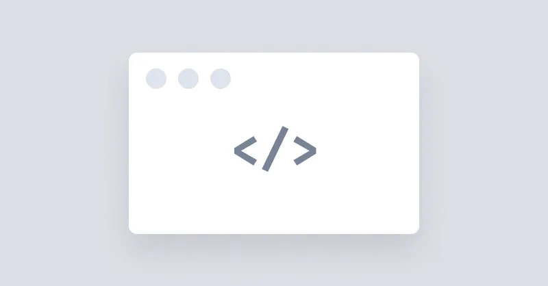
Code mockup
Code mockup is used to show a block of code in a box that looks like a code editor.

Phone mockup
Phone mockup shows a mockup of an iPhone.

Window mockup
Window mockup shows a box that looks like an operating system window.
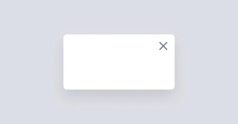
Modal
Modal is used to show a dialog or a box when you click a button.

Navbar
Navbar is used to show a navigation bar on the top of the page.
OTP
OTP (One-Time Password) component for inputting verification codes. It's usually 4 to 6 digits long and is used for two-factor authentication (2FA) or passwordless login.
Pagination
Pagination is a group of buttons that allow the user to navigate between a set of related content.

Progress
Progress bar can be used to show the progress of a task or to show the passing of time.

Radial progress
Radial progress can be used to show the progress of a task or to show the passing of time.

Radio
Radio buttons allow the user to select one option from a set.

Range slider
Range slider is used to select a value by sliding a handle.

Rating
Rating is a set of radio buttons that allow the user to rate something.
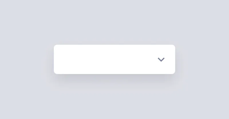
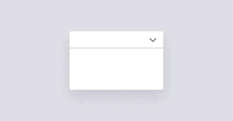
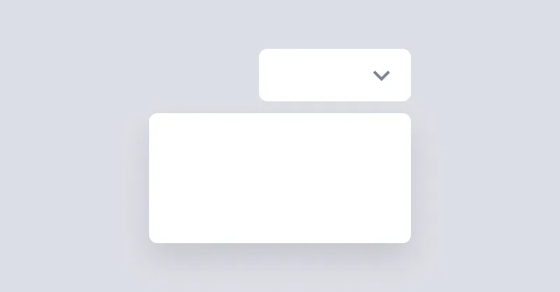
Select
Select is used to pick a value from a list of options.

Skeleton
Skeleton is a component that can be used to show a loading state of a component.
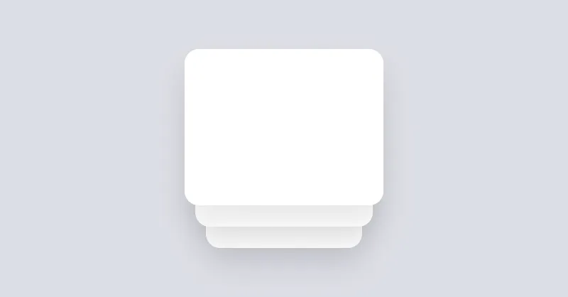
Stack
Stack visually puts elements on top of each other.

Stat
Stat is used to show numbers and data in a block.
Status
Status is a really small icon to visually show the current status of an element, like online, offline, error, etc.
Steps
Steps can be used to show a list of steps in a process.
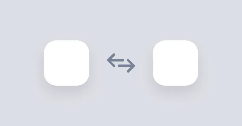
Swap
Swap allows you to toggle the visibility of two elements using a checkbox or a class name.
Tabs
Tabs can be used to show a list of links in a tabbed format.

Table
Table can be used to show a list of data in a table format.
Text Rotate
Text Rotate can show up to 6 lines of text, one at a time, with a an infinite loop animation. Duration is 10 seconds by default. The animation will pause on hover.
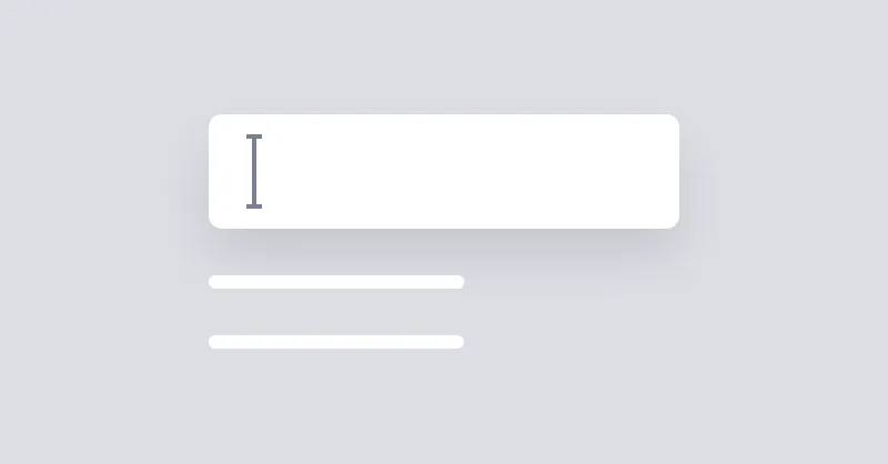
Textarea
Textarea allows users to enter text in multiple lines.

Theme Controller
If a checked checkbox input or a checked radio input with theme-controller class exists in the page, The page will have the same theme as that input's value.
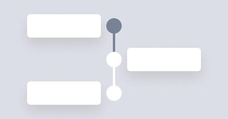
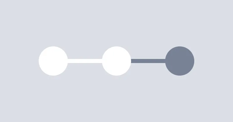
Timeline
Timeline component shows a list of events in chronological order.

Toast
Toast is a wrapper to stack elements, positioned on the corner of page.
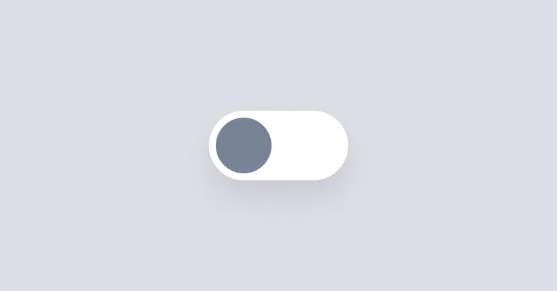
Toggle
Toggle is a checkbox that is styled to look like a switch button.

Tooltip
Tooltip can be used to show a message when hovering over an element.
Validator
Validator class changes the color of form elements to error or success based on input's validation rules.