Card
Cards are used to group and display content in a way that is easily readable.
| Class name | Type | |
|---|---|---|
| card | Component | Card |
| card-title | Part | Title part |
| card-body | Part | Body part (content) |
| card-actions | Part | Actions part (buttons, etc.) |
| card-border | Style | Adds border to <card> |
| card-dash | Style | dash style |
| card-side | Modifier | The image in <figure> will be on to the side |
| image-full | Modifier | The image in <figure> element will be the background |
| card-xs | Size | Extra small size |
| card-sm | Size | Small size |
| card-md | Size | Medium size (default) |
| card-lg | Size | Large size |
| card-xl | Size | Extra large size |
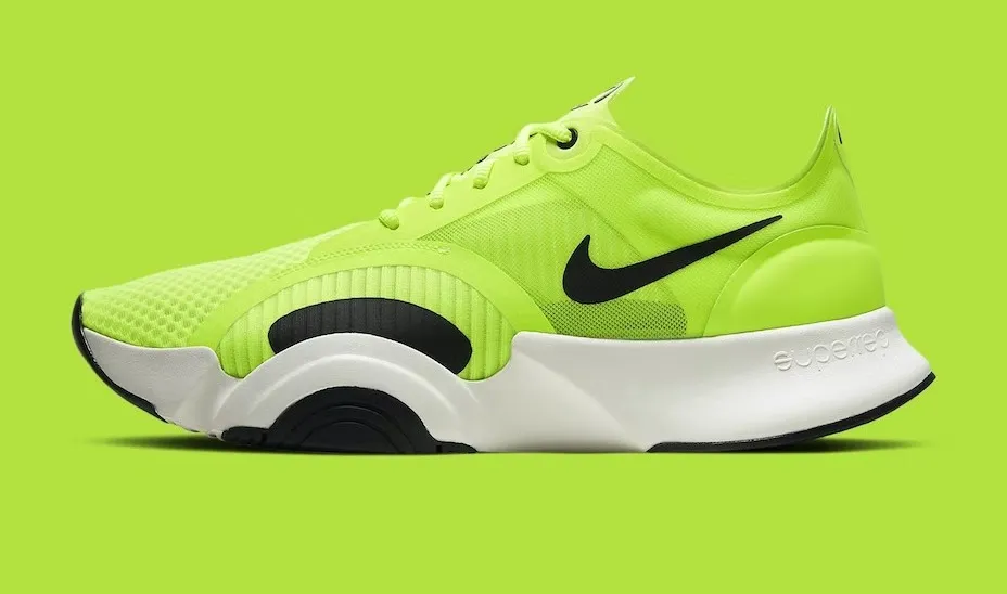
Card Title
A card component has a figure, a body part, and inside body there are title and actions parts
<div class="$$card bg-base-100 w-96 shadow-sm">
  <figure>
    <img
      src="https://img.daisyui.com/images/stock/photo-1606107557195-0e29a4b5b4aa.webp"
      alt="Shoes" />
  </figure>
  <div class="$$card-body">
    <h2 class="$$card-title">Card Title</h2>
    <p>A card component has a figure, a body part, and inside body there are title and actions parts</p>
    <div class="$$card-actions justify-end">
      <button class="$$btn $$btn-primary">Buy Now</button>
    </div>
  </div>
</div>
<div class="$$card bg-base-100 w-96 shadow-sm">
<figure>
<img
src="https://img.daisyui.com/images/stock/photo-1606107557195-0e29a4b5b4aa.webp"
alt="Shoes" />
</figure>
<div class="$$card-body">
<h2 class="$$card-title">Card Title</h2>
<p>A card component has a figure, a body part, and inside body there are title and actions parts</p>
<div class="$$card-actions justify-end">
<button class="$$btn $$btn-primary">Buy Now</button>
</div>
</div>
</div>Premium
$29/mo- High-resolution image generation
- Customizable style templates
- Batch processing capabilities
- AI-driven image enhancements
- Seamless cloud integration
- Real-time collaboration tools
<div class="$$card w-96 bg-base-100 shadow-sm">
  <div class="$$card-body">
    <span class="$$badge $$badge-xs $$badge-warning">Most Popular</span>
    <div class="flex justify-between">
      <h2 class="text-3xl font-bold">Premium</h2>
      <span class="text-xl">$29/mo</span>
    </div>
    <ul class="mt-6 flex flex-col gap-2 text-xs">
      <li>
        <svg xmlns="http://www.w3.org/2000/svg" class="size-4 me-2 inline-block text-success" fill="none" viewBox="0 0 24 24" stroke="currentColor"><path stroke-linecap="round" stroke-linejoin="round" stroke-width="2" d="M5 13l4 4L19 7" /></svg>
        <span>High-resolution image generation</span>
      </li>
      <li>
        <svg xmlns="http://www.w3.org/2000/svg" class="size-4 me-2 inline-block text-success" fill="none" viewBox="0 0 24 24" stroke="currentColor"><path stroke-linecap="round" stroke-linejoin="round" stroke-width="2" d="M5 13l4 4L19 7" /></svg>
        <span>Customizable style templates</span>
      </li>
      <li>
        <svg xmlns="http://www.w3.org/2000/svg" class="size-4 me-2 inline-block text-success" fill="none" viewBox="0 0 24 24" stroke="currentColor"><path stroke-linecap="round" stroke-linejoin="round" stroke-width="2" d="M5 13l4 4L19 7" /></svg>
        <span>Batch processing capabilities</span>
      </li>
      <li>
        <svg xmlns="http://www.w3.org/2000/svg" class="size-4 me-2 inline-block text-success" fill="none" viewBox="0 0 24 24" stroke="currentColor"><path stroke-linecap="round" stroke-linejoin="round" stroke-width="2" d="M5 13l4 4L19 7" /></svg>
        <span>AI-driven image enhancements</span>
      </li>
      <li class="opacity-50">
        <svg xmlns="http://www.w3.org/2000/svg" class="size-4 me-2 inline-block text-base-content/50" fill="none" viewBox="0 0 24 24" stroke="currentColor"><path stroke-linecap="round" stroke-linejoin="round" stroke-width="2" d="M5 13l4 4L19 7" /></svg>
        <span class="line-through">Seamless cloud integration</span>
      </li>
      <li class="opacity-50">
        <svg xmlns="http://www.w3.org/2000/svg" class="size-4 me-2 inline-block text-base-content/50" fill="none" viewBox="0 0 24 24" stroke="currentColor"><path stroke-linecap="round" stroke-linejoin="round" stroke-width="2" d="M5 13l4 4L19 7" /></svg>
        <span class="line-through">Real-time collaboration tools</span>
      </li>
    </ul>
    <div class="mt-6">
      <button class="$$btn $$btn-primary $$btn-block">Subscribe</button>
    </div>
  </div>
</div>
<div class="$$card w-96 bg-base-100 shadow-sm">
<div class="$$card-body">
<span class="$$badge $$badge-xs $$badge-warning">Most Popular</span>
<div class="flex justify-between">
<h2 class="text-3xl font-bold">Premium</h2>
<span class="text-xl">$29/mo</span>
</div>
<ul class="mt-6 flex flex-col gap-2 text-xs">
<li>
<svg xmlns="http://www.w3.org/2000/svg" class="size-4 me-2 inline-block text-success" fill="none" viewBox="0 0 24 24" stroke="currentColor"><path stroke-linecap="round" stroke-linejoin="round" stroke-width="2" d="M5 13l4 4L19 7" /></svg>
<span>High-resolution image generation</span>
</li>
<li>
<svg xmlns="http://www.w3.org/2000/svg" class="size-4 me-2 inline-block text-success" fill="none" viewBox="0 0 24 24" stroke="currentColor"><path stroke-linecap="round" stroke-linejoin="round" stroke-width="2" d="M5 13l4 4L19 7" /></svg>
<span>Customizable style templates</span>
</li>
<li>
<svg xmlns="http://www.w3.org/2000/svg" class="size-4 me-2 inline-block text-success" fill="none" viewBox="0 0 24 24" stroke="currentColor"><path stroke-linecap="round" stroke-linejoin="round" stroke-width="2" d="M5 13l4 4L19 7" /></svg>
<span>Batch processing capabilities</span>
</li>
<li>
<svg xmlns="http://www.w3.org/2000/svg" class="size-4 me-2 inline-block text-success" fill="none" viewBox="0 0 24 24" stroke="currentColor"><path stroke-linecap="round" stroke-linejoin="round" stroke-width="2" d="M5 13l4 4L19 7" /></svg>
<span>AI-driven image enhancements</span>
</li>
<li class="opacity-50">
<svg xmlns="http://www.w3.org/2000/svg" class="size-4 me-2 inline-block text-base-content/50" fill="none" viewBox="0 0 24 24" stroke="currentColor"><path stroke-linecap="round" stroke-linejoin="round" stroke-width="2" d="M5 13l4 4L19 7" /></svg>
<span class="line-through">Seamless cloud integration</span>
</li>
<li class="opacity-50">
<svg xmlns="http://www.w3.org/2000/svg" class="size-4 me-2 inline-block text-base-content/50" fill="none" viewBox="0 0 24 24" stroke="currentColor"><path stroke-linecap="round" stroke-linejoin="round" stroke-width="2" d="M5 13l4 4L19 7" /></svg>
<span class="line-through">Real-time collaboration tools</span>
</li>
</ul>
<div class="mt-6">
<button class="$$btn $$btn-primary $$btn-block">Subscribe</button>
</div>
</div>
</div>Xsmall Card
A card component has a figure, a body part, and inside body there are title and actions parts
Small Card
A card component has a figure, a body part, and inside body there are title and actions parts
Medium Card
A card component has a figure, a body part, and inside body there are title and actions parts
Large Card
A card component has a figure, a body part, and inside body there are title and actions parts
Xlarge Card
A card component has a figure, a body part, and inside body there are title and actions parts
<div class="$$card w-96 bg-base-100 $$card-xs shadow-sm">
  <div class="$$card-body">
    <h2 class="$$card-title">Xsmall Card</h2>
    <p>A card component has a figure, a body part, and inside body there are title and actions parts</p>
    <div class="justify-end $$card-actions">
      <button class="$$btn $$btn-primary">Buy Now</button>
    </div>
  </div>
</div>

<div class="$$card w-96 bg-base-100 $$card-sm shadow-sm">
  <div class="$$card-body">
    <h2 class="$$card-title">Small Card</h2>
    <p>A card component has a figure, a body part, and inside body there are title and actions parts</p>
    <div class="justify-end $$card-actions">
      <button class="$$btn $$btn-primary">Buy Now</button>
    </div>
  </div>
</div>

<div class="$$card w-96 bg-base-100 $$card-md shadow-sm">
  <div class="$$card-body">
    <h2 class="$$card-title">Medium Card</h2>
    <p>A card component has a figure, a body part, and inside body there are title and actions parts</p>
    <div class="justify-end $$card-actions">
      <button class="$$btn $$btn-primary">Buy Now</button>
    </div>
  </div>
</div>

<div class="$$card w-96 bg-base-100 $$card-lg shadow-sm">
  <div class="$$card-body">
    <h2 class="$$card-title">Large Card</h2>
    <p>A card component has a figure, a body part, and inside body there are title and actions parts</p>
    <div class="justify-end $$card-actions">
      <button class="$$btn $$btn-primary">Buy Now</button>
    </div>
  </div>
</div>

<div class="$$card w-96 bg-base-100 $$card-xl shadow-sm">
  <div class="$$card-body">
    <h2 class="$$card-title">Xlarge Card</h2>
    <p>A card component has a figure, a body part, and inside body there are title and actions parts</p>
    <div class="justify-end $$card-actions">
      <button class="$$btn $$btn-primary">Buy Now</button>
    </div>
  </div>
</div>
<div class="$$card w-96 bg-base-100 $$card-xs shadow-sm">
<div class="$$card-body">
<h2 class="$$card-title">Xsmall Card</h2>
<p>A card component has a figure, a body part, and inside body there are title and actions parts</p>
<div class="justify-end $$card-actions">
<button class="$$btn $$btn-primary">Buy Now</button>
</div>
</div>
</div>
<div class="$$card w-96 bg-base-100 $$card-sm shadow-sm">
<div class="$$card-body">
<h2 class="$$card-title">Small Card</h2>
<p>A card component has a figure, a body part, and inside body there are title and actions parts</p>
<div class="justify-end $$card-actions">
<button class="$$btn $$btn-primary">Buy Now</button>
</div>
</div>
</div>
<div class="$$card w-96 bg-base-100 $$card-md shadow-sm">
<div class="$$card-body">
<h2 class="$$card-title">Medium Card</h2>
<p>A card component has a figure, a body part, and inside body there are title and actions parts</p>
<div class="justify-end $$card-actions">
<button class="$$btn $$btn-primary">Buy Now</button>
</div>
</div>
</div>
<div class="$$card w-96 bg-base-100 $$card-lg shadow-sm">
<div class="$$card-body">
<h2 class="$$card-title">Large Card</h2>
<p>A card component has a figure, a body part, and inside body there are title and actions parts</p>
<div class="justify-end $$card-actions">
<button class="$$btn $$btn-primary">Buy Now</button>
</div>
</div>
</div>
<div class="$$card w-96 bg-base-100 $$card-xl shadow-sm">
<div class="$$card-body">
<h2 class="$$card-title">Xlarge Card</h2>
<p>A card component has a figure, a body part, and inside body there are title and actions parts</p>
<div class="justify-end $$card-actions">
<button class="$$btn $$btn-primary">Buy Now</button>
</div>
</div>
</div>Card Title
A card component has a figure, a body part, and inside body there are title and actions parts
<div class="$$card $$card-border bg-base-100 w-96">
  <div class="$$card-body">
    <h2 class="$$card-title">Card Title</h2>
    <p>A card component has a figure, a body part, and inside body there are title and actions parts</p>
    <div class="$$card-actions justify-end">
      <button class="$$btn $$btn-primary">Buy Now</button>
    </div>
  </div>
</div>
<div class="$$card $$card-border bg-base-100 w-96">
<div class="$$card-body">
<h2 class="$$card-title">Card Title</h2>
<p>A card component has a figure, a body part, and inside body there are title and actions parts</p>
<div class="$$card-actions justify-end">
<button class="$$btn $$btn-primary">Buy Now</button>
</div>
</div>
</div>Card Title
A card component has a figure, a body part, and inside body there are title and actions parts
<div class="$$card $$card-dash bg-base-100 w-96">
  <div class="$$card-body">
    <h2 class="$$card-title">Card Title</h2>
    <p>A card component has a figure, a body part, and inside body there are title and actions parts</p>
    <div class="$$card-actions justify-end">
      <button class="$$btn $$btn-primary">Buy Now</button>
    </div>
  </div>
</div>
<div class="$$card $$card-dash bg-base-100 w-96">
<div class="$$card-body">
<h2 class="$$card-title">Card Title</h2>
<p>A card component has a figure, a body part, and inside body there are title and actions parts</p>
<div class="$$card-actions justify-end">
<button class="$$btn $$btn-primary">Buy Now</button>
</div>
</div>
</div>Card Title NEW
A card component has a figure, a body part, and inside body there are title and actions parts
<div class="$$card bg-base-100 w-96 shadow-sm">
  <figure>
    <img
      src="https://img.daisyui.com/images/stock/photo-1606107557195-0e29a4b5b4aa.webp"
      alt="Shoes" />
  </figure>
  <div class="$$card-body">
    <h2 class="$$card-title">
      Card Title
      <div class="$$badge $$badge-secondary">NEW</div>
    </h2>
    <p>A card component has a figure, a body part, and inside body there are title and actions parts</p>
    <div class="$$card-actions justify-end">
      <div class="$$badge $$badge-outline">Fashion</div>
      <div class="$$badge $$badge-outline">Products</div>
    </div>
  </div>
</div>
<div class="$$card bg-base-100 w-96 shadow-sm">
<figure>
<img
src="https://img.daisyui.com/images/stock/photo-1606107557195-0e29a4b5b4aa.webp"
alt="Shoes" />
</figure>
<div class="$$card-body">
<h2 class="$$card-title">
Card Title
<div class="$$badge $$badge-secondary">NEW</div>
</h2>
<p>A card component has a figure, a body part, and inside body there are title and actions parts</p>
<div class="$$card-actions justify-end">
<div class="$$badge $$badge-outline">Fashion</div>
<div class="$$badge $$badge-outline">Products</div>
</div>
</div>
</div>Card Title
A card component has a figure, a body part, and inside body there are title and actions parts
<div class="$$card bg-base-100 w-96 shadow-sm">
  <div class="$$card-body">
    <h2 class="$$card-title">Card Title</h2>
    <p>A card component has a figure, a body part, and inside body there are title and actions parts</p>
  </div>
  <figure>
    <img
      src="https://img.daisyui.com/images/stock/photo-1606107557195-0e29a4b5b4aa.webp"
      alt="Shoes" />
  </figure>
</div>
<div class="$$card bg-base-100 w-96 shadow-sm">
<div class="$$card-body">
<h2 class="$$card-title">Card Title</h2>
<p>A card component has a figure, a body part, and inside body there are title and actions parts</p>
</div>
<figure>
<img
src="https://img.daisyui.com/images/stock/photo-1606107557195-0e29a4b5b4aa.webp"
alt="Shoes" />
</figure>
</div>Card Title
A card component has a figure, a body part, and inside body there are title and actions parts
<div class="$$card bg-base-100 w-96 shadow-sm">
  <figure class="px-10 pt-10">
    <img
      src="https://img.daisyui.com/images/stock/photo-1606107557195-0e29a4b5b4aa.webp"
      alt="Shoes"
      class="rounded-xl" />
  </figure>
  <div class="$$card-body items-center text-center">
    <h2 class="$$card-title">Card Title</h2>
    <p>A card component has a figure, a body part, and inside body there are title and actions parts</p>
    <div class="$$card-actions">
      <button class="$$btn $$btn-primary">Buy Now</button>
    </div>
  </div>
</div>
<div class="$$card bg-base-100 w-96 shadow-sm">
<figure class="px-10 pt-10">
<img
src="https://img.daisyui.com/images/stock/photo-1606107557195-0e29a4b5b4aa.webp"
alt="Shoes"
class="rounded-xl" />
</figure>
<div class="$$card-body items-center text-center">
<h2 class="$$card-title">Card Title</h2>
<p>A card component has a figure, a body part, and inside body there are title and actions parts</p>
<div class="$$card-actions">
<button class="$$btn $$btn-primary">Buy Now</button>
</div>
</div>
</div>Card Title
A card component has a figure, a body part, and inside body there are title and actions parts
<div class="$$card bg-base-100 $$image-full w-96 shadow-sm">
  <figure>
    <img
      src="https://img.daisyui.com/images/stock/photo-1606107557195-0e29a4b5b4aa.webp"
      alt="Shoes" />
  </figure>
  <div class="$$card-body">
    <h2 class="$$card-title">Card Title</h2>
    <p>A card component has a figure, a body part, and inside body there are title and actions parts</p>
    <div class="$$card-actions justify-end">
      <button class="$$btn $$btn-primary">Buy Now</button>
    </div>
  </div>
</div>
<div class="$$card bg-base-100 $$image-full w-96 shadow-sm">
<figure>
<img
src="https://img.daisyui.com/images/stock/photo-1606107557195-0e29a4b5b4aa.webp"
alt="Shoes" />
</figure>
<div class="$$card-body">
<h2 class="$$card-title">Card Title</h2>
<p>A card component has a figure, a body part, and inside body there are title and actions parts</p>
<div class="$$card-actions justify-end">
<button class="$$btn $$btn-primary">Buy Now</button>
</div>
</div>
</div>Card title!
A card component has a figure, a body part, and inside body there are title and actions parts
<div class="$$card bg-base-100 w-96 shadow-sm">
  <div class="$$card-body">
    <h2 class="$$card-title">Card title!</h2>
    <p>A card component has a figure, a body part, and inside body there are title and actions parts</p>
    <div class="$$card-actions justify-end">
      <button class="$$btn $$btn-primary">Buy Now</button>
    </div>
  </div>
</div>
<div class="$$card bg-base-100 w-96 shadow-sm">
<div class="$$card-body">
<h2 class="$$card-title">Card title!</h2>
<p>A card component has a figure, a body part, and inside body there are title and actions parts</p>
<div class="$$card-actions justify-end">
<button class="$$btn $$btn-primary">Buy Now</button>
</div>
</div>
</div>Card title!
A card component has a figure, a body part, and inside body there are title and actions parts
<div class="$$card bg-primary text-primary-content w-96">
  <div class="$$card-body">
    <h2 class="$$card-title">Card title!</h2>
    <p>A card component has a figure, a body part, and inside body there are title and actions parts</p>
    <div class="$$card-actions justify-end">
      <button class="$$btn">Buy Now</button>
    </div>
  </div>
</div>
<div class="$$card bg-primary text-primary-content w-96">
<div class="$$card-body">
<h2 class="$$card-title">Card title!</h2>
<p>A card component has a figure, a body part, and inside body there are title and actions parts</p>
<div class="$$card-actions justify-end">
<button class="$$btn">Buy Now</button>
</div>
</div>
</div>Cookies!
We are using cookies for no reason.
<div class="$$card bg-neutral text-neutral-content w-96">
  <div class="$$card-body items-center text-center">
    <h2 class="$$card-title">Cookies!</h2>
    <p>We are using cookies for no reason.</p>
    <div class="$$card-actions justify-end">
      <button class="$$btn $$btn-primary">Accept</button>
      <button class="$$btn $$btn-ghost">Deny</button>
    </div>
  </div>
</div>
<div class="$$card bg-neutral text-neutral-content w-96">
<div class="$$card-body items-center text-center">
<h2 class="$$card-title">Cookies!</h2>
<p>We are using cookies for no reason.</p>
<div class="$$card-actions justify-end">
<button class="$$btn $$btn-primary">Accept</button>
<button class="$$btn $$btn-ghost">Deny</button>
</div>
</div>
</div>We are using cookies for no reason.
<div class="$$card bg-base-100 w-96 shadow-sm">
  <div class="$$card-body">
    <div class="$$card-actions justify-end">
      <button class="$$btn $$btn-square $$btn-sm">
        <svg
          xmlns="http://www.w3.org/2000/svg"
          class="h-6 w-6"
          fill="none"
          viewBox="0 0 24 24"
          stroke="currentColor">
          <path
            stroke-linecap="round"
            stroke-linejoin="round"
            stroke-width="2"
            d="M6 18L18 6M6 6l12 12" />
        </svg>
      </button>
    </div>
    <p>We are using cookies for no reason.</p>
  </div>
</div>
<div class="$$card bg-base-100 w-96 shadow-sm">
<div class="$$card-body">
<div class="$$card-actions justify-end">
<button class="$$btn $$btn-square $$btn-sm">
<svg
xmlns="http://www.w3.org/2000/svg"
class="h-6 w-6"
fill="none"
viewBox="0 0 24 24"
stroke="currentColor">
<path
stroke-linecap="round"
stroke-linejoin="round"
stroke-width="2"
d="M6 18L18 6M6 6l12 12" />
</svg>
</button>
</div>
<p>We are using cookies for no reason.</p>
</div>
</div>
New movie is released!
Click the button to watch on Jetflix app.
<div class="$$card $$card-side bg-base-100 shadow-sm">
  <figure>
    <img
      src="https://img.daisyui.com/images/stock/photo-1635805737707-575885ab0820.webp"
      alt="Movie" />
  </figure>
  <div class="$$card-body">
    <h2 class="$$card-title">New movie is released!</h2>
    <p>Click the button to watch on Jetflix app.</p>
    <div class="$$card-actions justify-end">
      <button class="$$btn $$btn-primary">Watch</button>
    </div>
  </div>
</div>
<div class="$$card $$card-side bg-base-100 shadow-sm">
<figure>
<img
src="https://img.daisyui.com/images/stock/photo-1635805737707-575885ab0820.webp"
alt="Movie" />
</figure>
<div class="$$card-body">
<h2 class="$$card-title">New movie is released!</h2>
<p>Click the button to watch on Jetflix app.</p>
<div class="$$card-actions justify-end">
<button class="$$btn $$btn-primary">Watch</button>
</div>
</div>
</div>
New album is released!
Click the button to listen on Spotiwhy app.
<div class="$$card lg:$$card-side bg-base-100 shadow-sm">
  <figure>
    <img
      src="https://img.daisyui.com/images/stock/photo-1494232410401-ad00d5433cfa.webp"
      alt="Album" />
  </figure>
  <div class="$$card-body">
    <h2 class="$$card-title">New album is released!</h2>
    <p>Click the button to listen on Spotiwhy app.</p>
    <div class="$$card-actions justify-end">
      <button class="$$btn $$btn-primary">Listen</button>
    </div>
  </div>
</div>
<div class="$$card lg:$$card-side bg-base-100 shadow-sm">
<figure>
<img
src="https://img.daisyui.com/images/stock/photo-1494232410401-ad00d5433cfa.webp"
alt="Album" />
</figure>
<div class="$$card-body">
<h2 class="$$card-title">New album is released!</h2>
<p>Click the button to listen on Spotiwhy app.</p>
<div class="$$card-actions justify-end">
<button class="$$btn $$btn-primary">Listen</button>
</div>
</div>
</div><div class="flex flex-wrap items-start gap-3">
<label class="$$card bg-accent text-accent-content">
<input type="checkbox" name="card-urgent-1" />
<div class="$$card-body">
<h2 class="$$card-title">Urgent</h2>
<p>Same day delivery</p>
</div>
</label>
<div class="$$join bg-base-300 rounded-selector">
<label class="$$join-item $$card">
<input type="radio" value="sm" name="card-size-1" />
<div class="$$card-body">
<h2 class="$$card-title">Size SM</h2>
<p>Available</p>
</div>
</label>
<label class="$$join-item $$card">
<input type="radio" value="md" name="card-size-1" disabled />
<div class="$$card-body opacity-60">
<h2 class="$$card-title">Size MD</h2>
<p>Not available</p>
</div>
</label>
<label class="$$join-item $$card">
<input type="radio" value="lg" name="card-size-1" />
<div class="$$card-body">
<h2 class="$$card-title">Size LG</h2>
<p>Short supply</p>
</div>
</label>
</div>
</div>