Themes
Change Colors
base
primary
secondary
accent
neutral
info
success
warning
error
Radius
Boxes card, modal, alert
Fields button, input, select, tab
Selectors checkbox, toggle, badge
Effects
Sizes
Fields button, input, select, tab
xs NaN
sm NaN
md NaN
lg NaN
xl NaN
Fields base size
NaN
Pixels
Selectors checkbox, toggle, badge
xs NaN
sm NaN
md NaN
lg NaN
xl NaN
Selectors base size
NaN
Pixels
Border Width All components
Options
Default theme
Default dark theme
Dark color scheme
Components Demo
Preview more
Shoes Bags
25
3
0
4
12 M
13 T
14 W
15 T
16 F
17 S
18 S
Team Sync Meeting
Weekly product review with design and development teams
1h
Tab content 1
Tab content 2
Tab content 3
Price range
50
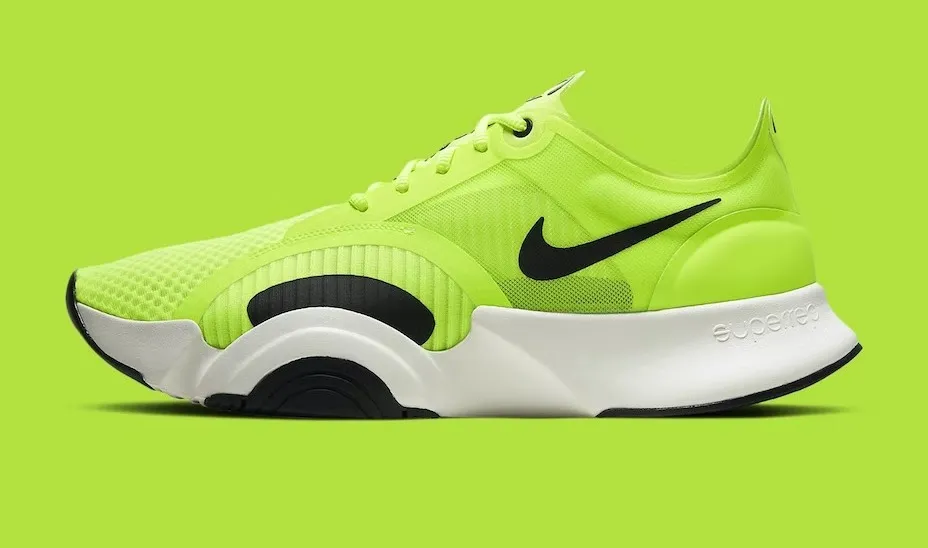
Nike Shoes SALE
420 reviews
$120 $150
Create new account
Registration is free and only takes a minute
Password must be 8+ characters
Sales volume reached $12,450 this week, showing a 15% increase from the previous period.
91
Page Score
91/100
All good
Recent orders
Charlie Chapman Send
Howard Hudson Failed
Fiona Fisher In progress
Nick Nelson Completed
Amanda Anderson Completed
October Revenue
$32,400
21% more than last month
Write a new post
1200 characters remaining

Obi-Wan Kenobi
It's over Anakin
I have the high ground

You underestimate my power
PM Zoomcall ASMR
Project Manager talking for 2 hours
13:39 120:00
npm i daisyuiinstalling...Done! There are 9 new messages
Verification process completed
Click to verify your email
Access denied
- Harry Potter and Sorcerer's Stack
Harry Potter and Chamber of Servers
Harry Potter and Prisoner of Azure
Harry Potter and Goblet of Firebase
Harry Potter and Elixir of Phoenix
Harry Potter and Half-Deployed App
Harry Potter and Deathly Frameworks
SALE
Starter Plan
$200/month
20 Tokens per day
10 Projects
API Access
Priority Support