daisyUI 5 release notes
Everything about the new daisyUI 5 release
Welcome! 🎉
daisyUI, the essential component library for Tailwind CSS is now being used in 360,000 open source projects, with 19 million npm installs (350 thousand weekly installs). daisyUI is growing faster than before and today it's helping many people, startups and companies to create improve their development experience.
💚 daisyUI became possible thanks to your incredible contributions, helpful feedback, and amazing support. Thank you!
Since the release of daisyUI 4 in 2023, a lot of feedback, feature requests, and bug reports have been received. Big efforts went into preparing daisyUI for this major release, using the latest web standards and new CSS/HTML features, as well as all the amazing new Tailwind CSS 4 features.
Here's daisyUI 5 with a lot of new features, improvements, and bug fixes. It's a huge update, I added TLDR for each section to make it easier to read.
Let's begin!
Table of Contents
- Install
- Core Improvement
- Build and integration improvements
- Design System Improvements
- Themes and styling
- New components
- Major component improvements
- Component design improvements
- Component size scale improvements
- Detailed Changelog
- Breaking changes in class names
- Breaking changes in design system
- Breaking changes in config
- Breaking changes in themes
- Bug fixes
- Get started with daisyUI 5
Install
1. Core Improvement
TLDR – daisyUI 5 is compatible with Tailwind CSS 4, has zero dependencies, a smaller package size, smaller CSS size, and is more customizable. CSS variables are now more readable and more flexible.
Skip to the next section
Tailwind CSS 4 compatibility
Tailwind CSS 4 is crazy good! A lot of new features and improvements are added and also many changes to the plugin API.
daisyUI 5 works with Tailwind CSS 4 and takes advantage of all the new features.
With Tailwind CSS 4, you can now import daisyUI as a plugin in the CSS file.
// tailwind.config.{js,ts,mjs,cjs}
module.exports = {
  content: ["./src/**/*.{html,js}"],
  plugins: [
    require('daisyui');
  ],
}/* app.css */
@import "tailwindcss";
@plugin "daisyui";
See Tailwind CSS upgrade guide for more information.
Zero dependencies
Reducing the number of dependencies in your project is important for many reasons. It leads to faster build times and better performance in your workflow. Fewer dependencies also make your app more secure by reducing the chance of potential for vulnerabilities from less maintained packages. Also, managing a smaller dependency tree makes maintenance easier and reduces the chance of deprecation problems or version conflict in the long term.
Last year I reduced the number of dependencies in daisyUI, from ~100 (dependencies + sub dependencies in total) to 7!
This time we got rid of all the remaining ones!
daisyUI 5 has no dependencies. Hopefully this helps to clean up your node_modules a little bit.
Dependencies - Total 1.8 MB on disk (250 files)
  ├╴ culori
  ├╴ picocolors
  ├╴ postcss-js
  │  ╰╴ camelcase-css
  ╰╴ css-selector-tokenizer
     ├╴ cssesc
╰╴ fastparseNo dependencies - 0 kB

Smaller size
With daisyUI as a Tailwind CSS plugin, only the needed styles are included in the final CSS file. Other than that we have made a lot of optimizations to make both package size and CSS file size smaller.
daisyUI 5 NPM package is 61% smaller in size.
- Before
- Install size – 4.7 MB
- After
- Install size – 1.8 MB
daisyUI 5 CDN file, including all possible class names, is 75% smaller in size
- Before
- full.css – 137 kB compressed
- After
- daisyui.css – 34 kB compressed
It is now safe and efficient to use the CDN file in production. The compressed CSS file, is now 34 kB only thanks to native CSS nesting and huge amount of optimizations in daisyUI 5. This is the smallest size ever for the daisyUI CDN file, including all the possible daisyUI components and colors, available for all Tailwind CSS responsive prefixes. This is a CSS file, minified, compressed and cached on CDN.

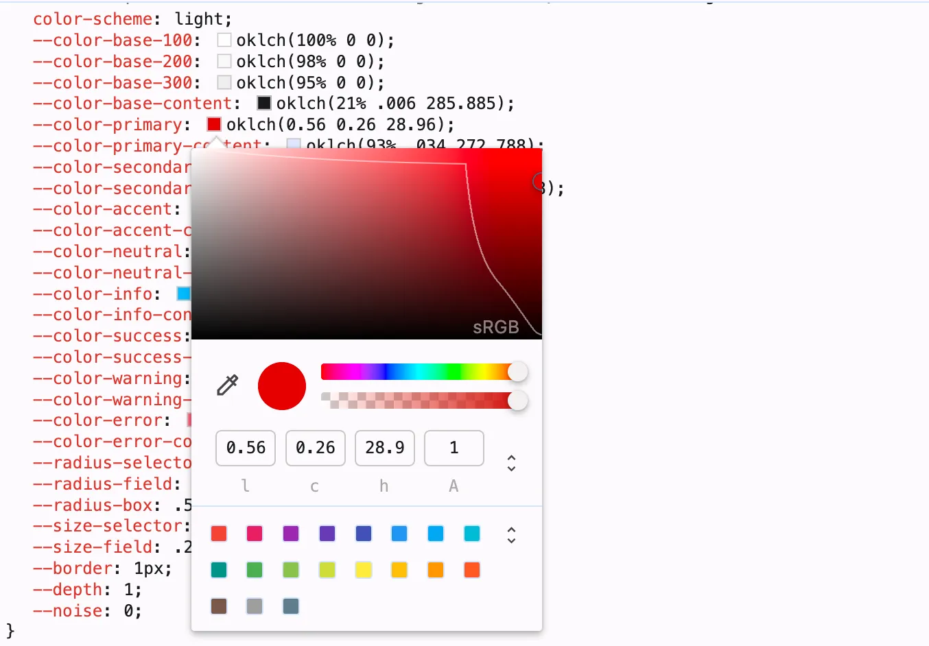
Improved color variables
With Tailwind CSS 3 and daisyUI 4, we had to extract the color values of each color into CSS variables, and pass it to Tailwind CSS alongside a special <alpha-value> variable so Tailwind CSS could generate opacity variables for each color utility class.
Tailwind CSS 4 doesn't have this limitation because it uses CSS color-mix() to control the opacity.
With daisyUI 5 we can finally put the whole color inside CSS variables. All color formats are supported, no transformation is needed no JS object is needed.
We also updated the variable names to be more readable in the output CSS, which means you can even customize the color values using the browser dev tools color picker.
/* hard to read variable names, hard to customize values */
{
--b1: 100% 0 0;
--b2: 96.1151% 0 0;
--b3: 92.4169% .00108 197.137559;
--bc: 27.8078% .029596 256.847952;
--p: 49.12% .3096 275.75;
--pc: 89.824% .06192 275.75;
--s: 69.71% .329 342.55;
--sc: 98.71% .0106 342.55;
--a: 76.76% .184 183.61;
--ac: 15.352% .0368 183.61;
--n: 32.1785% .02476 255.701624;
--nc: 89.4994% .011585 252.096176;
--in: 72.06% .191 231.6;
--inc: 0% 0 0;
--su: 64.8% .15 160;
--suc: 0% 0 0;
--wa: 84.71% .199 83.87;
--wac: 0% 0 0;
--er: 71.76% .221 22.18;
--erc: 0% 0 0;
}/* standard color format, easy to customize in browser */
{
--color-base-100: oklch(100% 0 0);
--color-base-200: oklch(96.115% 0 0);
--color-base-300: oklch(92.416% 0.001 197.137);
--color-base-content: oklch(27.807% 0.029 256.847);
--color-primary: oklch(49.12% 0.309 275.75);
--color-primary-content: oklch(89.824% 0.061 275.75);
--color-secondary: oklch(69.71% 0.329 342.55);
--color-secondary-content: oklch(98.71% 0.01 342.55);
--color-accent: oklch(76.76% 0.184 183.61);
--color-accent-content: oklch(15.352% 0.036 183.61);
--color-neutral: oklch(20% 0.024 255.701);
--color-neutral-content: oklch(89.499% 0.011 252.096);
--color-info: oklch(72.06% 0.191 231.6);
--color-info-content: oklch(0% 0 0);
--color-success: oklch(64.8% 0.15 160);
--color-success-content: oklch(0% 0 0);
--color-warning: oklch(84.71% 0.199 83.87);
--color-warning-content: oklch(0% 0 0);
--color-error: oklch(71.76% 0.221 22.18);
--color-error-content: oklch(0% 0 0);
}
2. Build and integration improvements
TLDR – Import only the parts you need.
Micro CSS files are now available for no-build projects.
Native CSS nesting reduces CSS size.
It's ESM compatible and has dependency-free class name prefixing.
Skip to the next section
Native CSS nesting
CSS nesting is now supported on all browsers. daisyUI 5 uses CSS nesting which prevents duplication of CSS rules and results smaller CSS size in your browser!
ESM compatibility
daisyUI 5 is now ESM (ECMAScript Module) compatible. Which means you can import and use specific parts of the library in JS if you need to.
Dependency-free class name prefixing
daisyUI 5 can now prefix class names without a dependency.
Micro CSS files for No-Build projects
For server-side rendered projects (Rails, Django, PHP, etc) or projects that don't have a JS build step (HTMX, Alpine.js, WordPress, etc), it's now possible to use specific parts of daisyUI without including the entire library or even without Tailwind CSS.
For example if you only want to use daisyUI toggle component, include a tiny CSS file that only contains the styles for the toggle component:
Not possiblehttps://cdn.jsdelivr.net/npm/daisyui@5/components/toggle.cssAll components, all themes, and basically every single part of daisyUI library is now available as compressed. minified CSS files on CDN.
Also, with the 75% smaller daisyui.css (formerly full.css) CDN file, it is now safe and efficient to use the CDN file in production. The compressed CSS file, is now 34 kB only thanks to native CSS nesting and huge amount of optimizations in daisyUI 5.
Check out the CDN docs to customize the parts of the library you want to include in your project from the CDN.
Include and Exclude parts of the library
Now for the first time, it's possible to include/exclude specific parts of daisyUI library. For example if you only want to use the "Toggle" component, you can include only the "Toggle" component and exclude everything else!
Not possible
@plugin "daisyui" {
  include: toggle;
}Not possible
@plugin "daisyui" {
  exclude: scrollbar;
}
3. Design System Improvements
TLDR – New "Effect" CSS variables.
Size improvements + newxlsize modifier.
New component style modifiers:*-softand*-dash.
Color format flexibility.
Skip to the next section
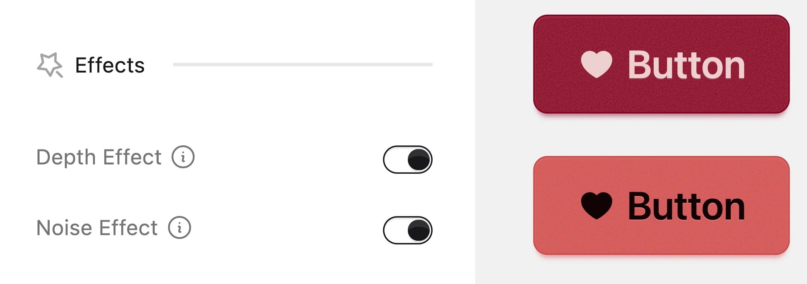
New "Effect" CSS variables
daisyUI 5 introduces a new set of effects that can be enabled or disabled globally or per theme. These effects change the look and feel of relevant components, like buttons, checkbox, toggle, etc.
Currently, the following effects are available:
--depth: adds a clean, subtle depth effect to the components, making them look more visually appealing--noise: adds a slight noise effect to the components, giving them a more textured look
These effects can be enabled or disabled using a CSS variable. Check out the new Theme Generator page to see how it works.
New "X-Large" size
All components that previously had xs, sm, md, and lg size modifiers now also support a new xl size modifier. This gives you more control over the size of components and allows you to create more flexible and responsive designs.
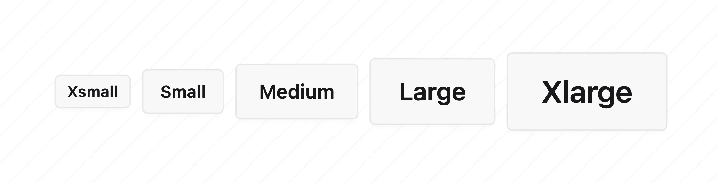
Size scale improvements
With the addition of the new xl size modifier, the size scale of components has been adjusted to make it consistent. The new size scale is more harmonious and visually appealing.
In daisyUI 4, the size difference between sizes was not following a consistent scale.
The new default size scale is consistent and more visually appealing ...and it's customizable!
| Button height scale | Before | After |
|---|---|---|
xs | 6 × 4 = 24px | 6 × 4 = 24px |
sm | 8 × 4 = 32px | 8 × 4 = 32px |
md | 12 × 4 = 48px | 10 × 4 = 40px |
lg | 16 × 4 = 64px | 12 × 4 = 48px |
xl | - | 14 × 4 = 56px |
| Checkbox height scale | Before | After |
|---|---|---|
xs | 4 × 4 = 16px | 4 × 4 = 16px |
sm | 5 × 4 = 20px | 5 × 4 = 20px |
md | 6 × 4 = 24px | 6 × 4 = 24px |
lg | 8 × 4 = 32px | 7 × 4 = 28px |
xl | - | 8 × 4 = 32px |

Size scale customization
Component size scales are now customizable. Previously, customizing the size of components required a lot of manual work.
Now everything is tokenized with CSS variables, You can define the size scale of the components globally or per theme, making them shorter or taller, based on your design needs.
--size-fieldvariable is used to define the base size of fields like input, button, tab, etc.--size-selectorvariable is used to define the base size of selectors like checkbox, radio, toggle, badge, etc.
See how it works in the new Theme Generator page.
Border size customization
Border size of buttons, inputs, tab, et are now customizable globally or per theme.
--bordervariable is used to define the border size of components like button, input, tab, etc.
See how it works in the new Theme Generator page.
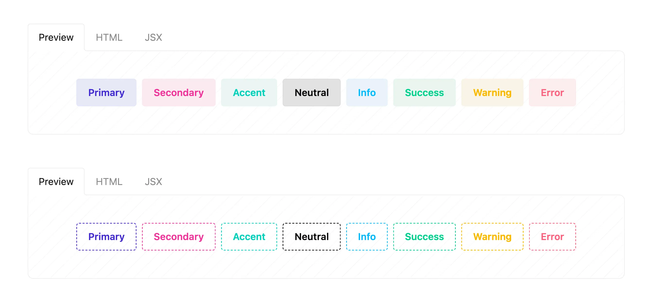
New component styles: "soft" and "dash"
Components like button, badge, alert now have soft and dash styles.
soft style makes the component look softer and dash style adds a dashed border to the component.
All modifier classes are now responsive
daisyUI 5 makes all modifiers responsive by default. This means you can use responsive modifiers like md:, lg:, etc. with all component modifier classes, not just a selected few.
Color format flexibility
daisyUI 5 supports all color formats and doesn't convert your colors to a specific format.
Before Tailwind CSS 4, color values of utility classes had to be generated at build time so the only way to have CSS variables for colors and being able to use Tailwind CSS opacity modifiers was to use a specific color format and pass it tailwind to generate the opacity variables.
Tailwind CSS 4 now uses CSS variables for colors and color-mix() to control the opacity. This means we can use any color format we want and no transformation is needed.
daisyUI built-in themes still use OKLCH color format and I would recommend using OKLCH for custom themes too, but you can use any color format you want and neither daisyUI nor Tailwind CSS will convert it to another format at build time.
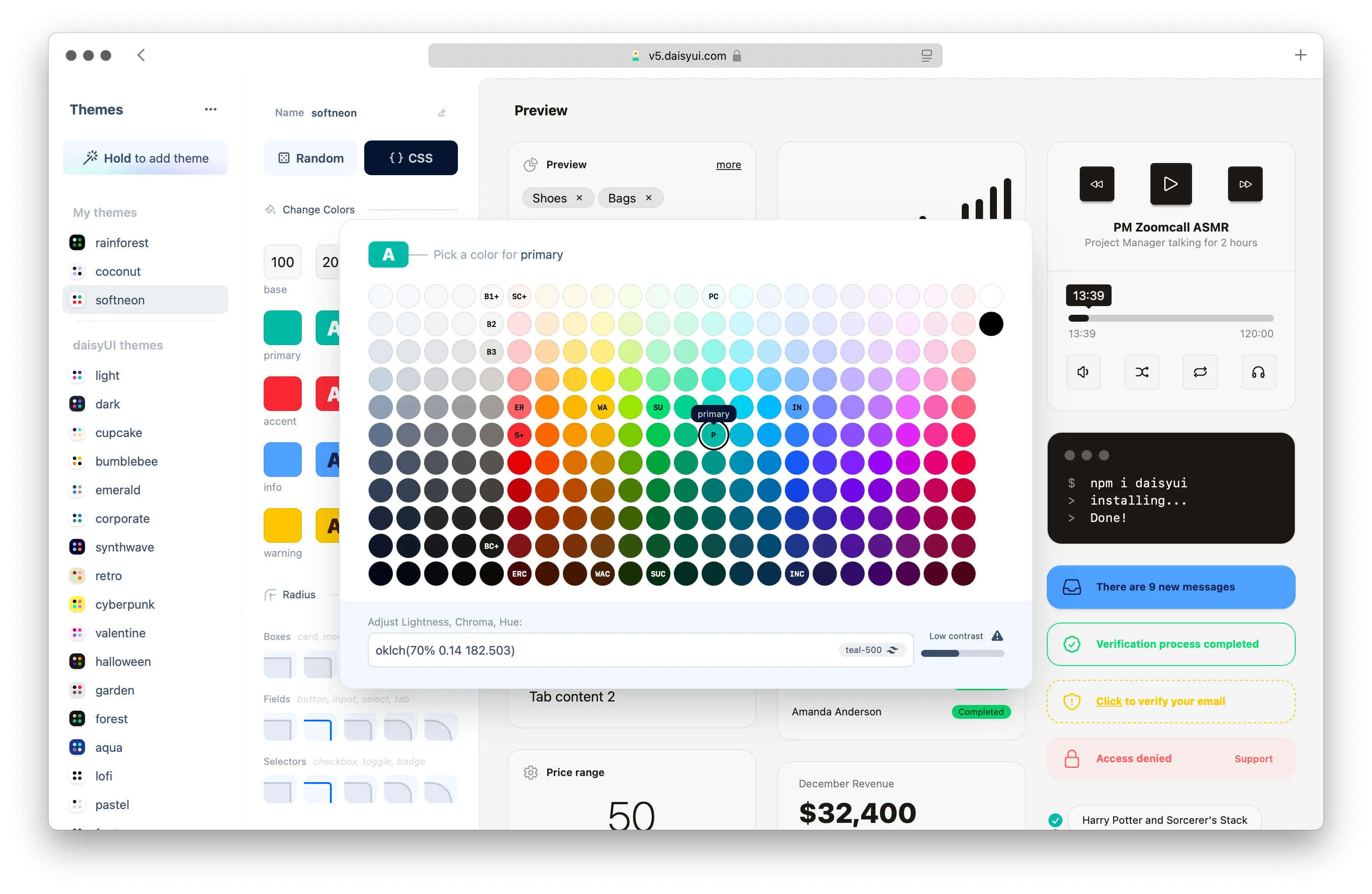
4. Themes and styling
Themes and colors are what makes your website unique. We've made significant improvements to the themes and colors in daisyUI 5, including new themes, improved existing themes, and a new Theme Generator to help you create your own custom themes.
TLDR – New themes + improved existing themes.
New Theme Generator to create custom themes.
Skip to the next section
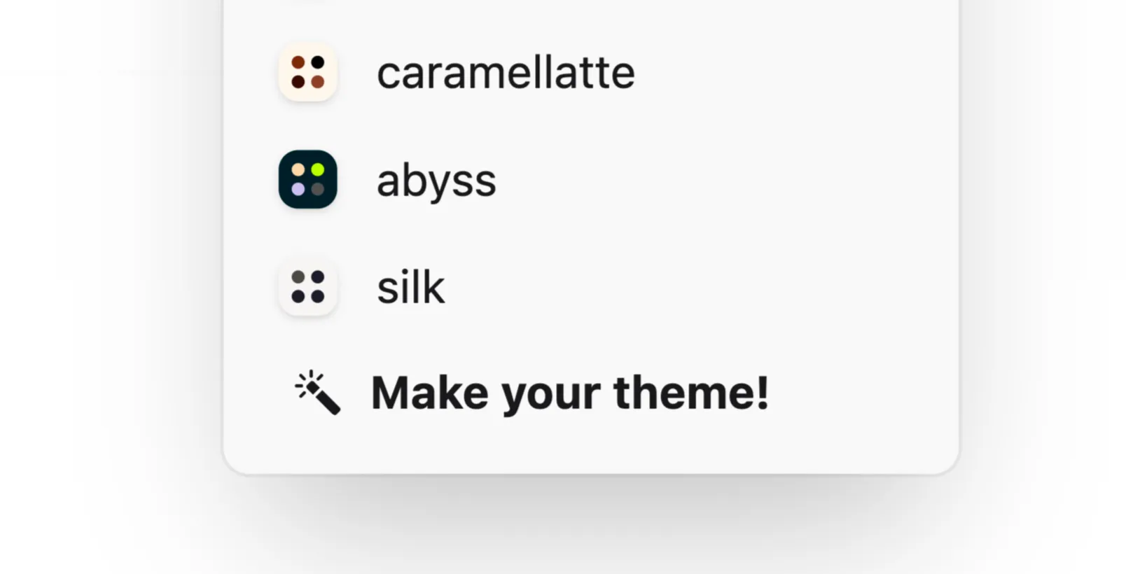
New themes
daisyUI 5 includes 3 new themes:
caramellatte– Warm, cozy, light theme featuring brown and beigeabyss– Deep dark green, teal and phosphorus color palettesilk– Bright, clean and bold theme with fluorescent text colors
Existing themes improvements
Most daisyUI themes have been adjusted to look better and consistent. color contrast and accessibility got even better and the colors are more harmonious. These changes make the color more visually appealing and easier to read.

All-new Theme Generator
Check out the new Theme Generator page to create your own custom theme. Create, customize or extend themes, or generate stunning new themes using the new daisyUI color palette generator algorithm.
5. New components
daisyUI 5 introduces new components to help you build websites faster.
TLDR – New components: List, Status, Fieldset, Label, Filter, Calendar, Validator, Dock.
Skip to the next section
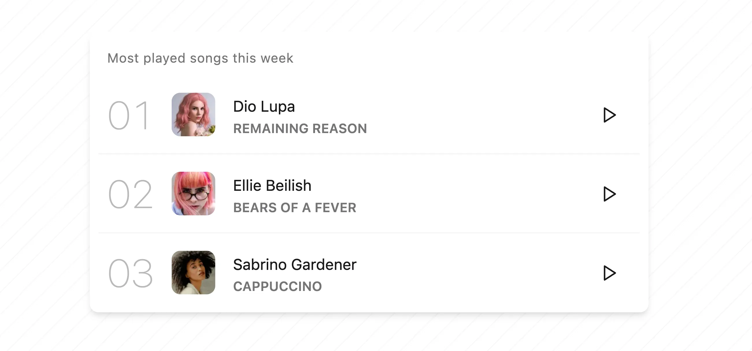
List
List is is useful for vertical layout to display information in rows. Imagine a list of products, list of people, list of articles, etc.
Status
Status is a really small icon to visually show the current status of an element, like online, offline, error, etc.
Available in 5 sizes: xs, sm, md, lg, and xl.

Fieldset
Fieldset is a container for grouping related form elements. It includes fieldset-legend as a title and label as a description.
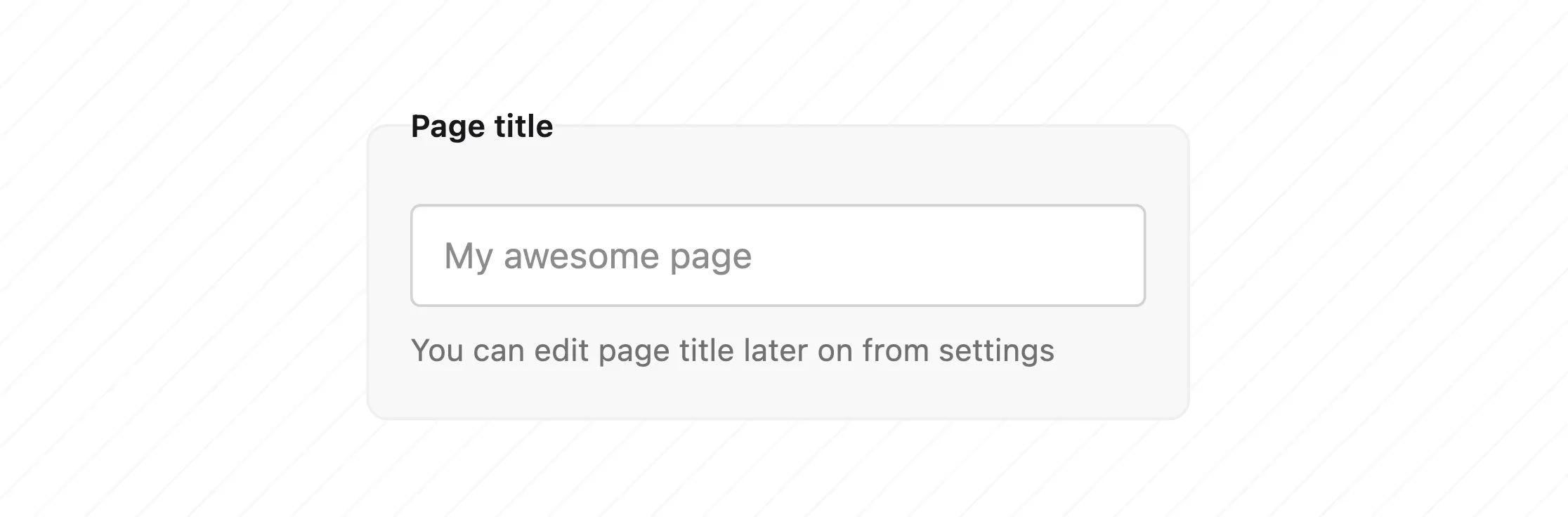
Label
Label provides a name or title for an input field. Label can be placed before or after the field. floating-label is a label that floats above the field when the field is focused.

Filter
Filter is a group of radio buttons. Choosing one of the options will hide the others and shows a reset button next to the chosen option.

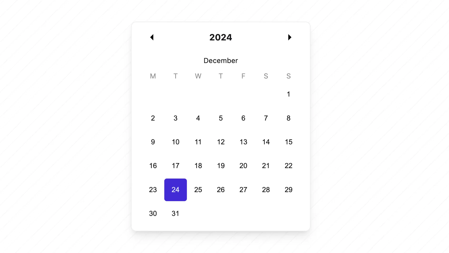
Calendar
daisyUI 5 provides all the necessary styles for 3 popular calendar/datepicker libraries: Cally, Pikaday, and React Day Picker.
This means you can use any of these libraries the style will be compatible with daisyUI colors and styles.
- Cally is a web component calendar datepicker and it works everywhere
- Pikaday is a simple and easy-to-use JS datepicker and it works everywhere
- React Day Picker is a flexible date picker for React
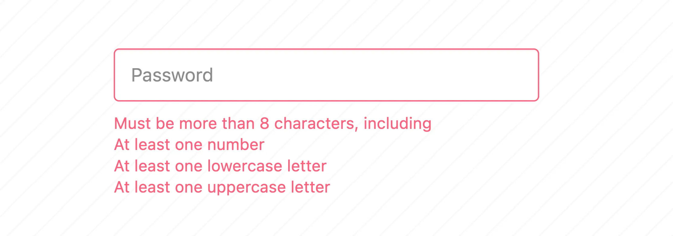
Validator
Validator class changes the color of form elements to error or success based on input's validation rules. It can also show a hint text below the input if it's invalid.
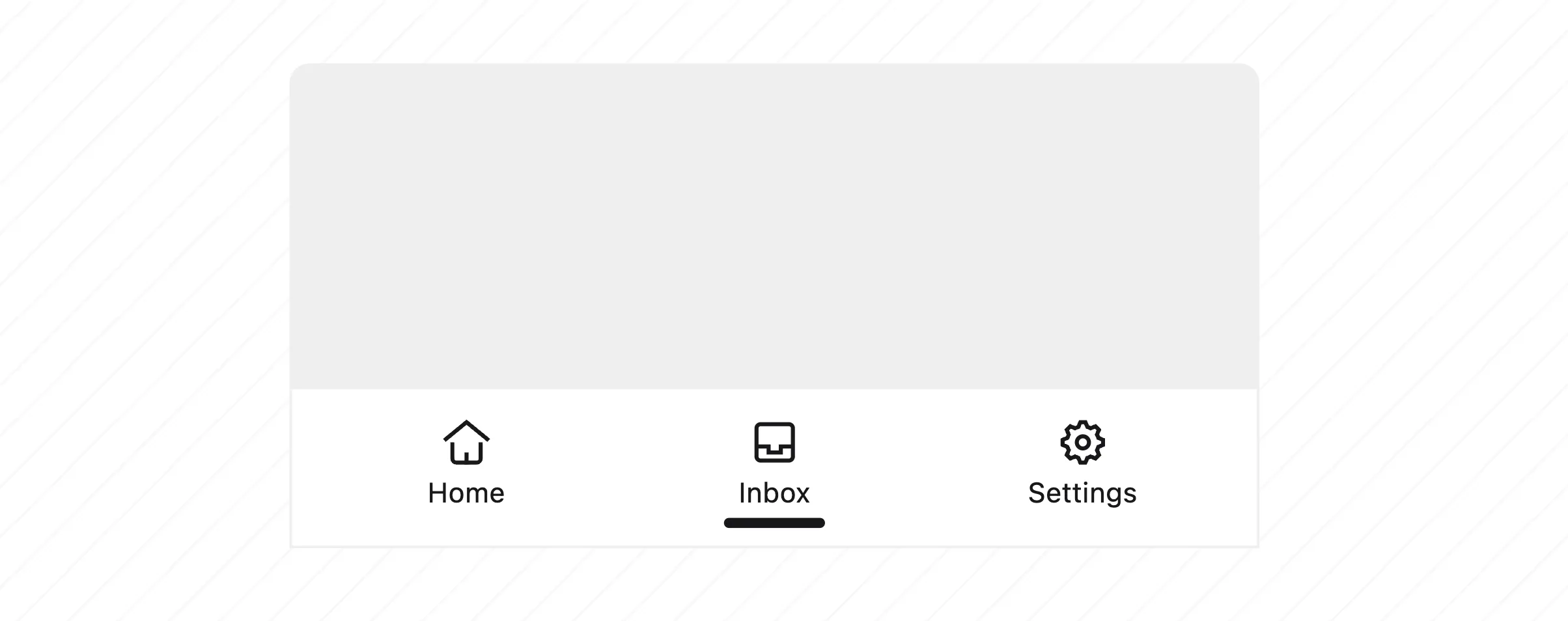
Dock
A redesigned replacement for "bottom navigation" component. Dock is a horizontal navigation bar that sticks to the bottom of the screen, new design, new look and more customizable.
Available in 5 sizes: xs, sm, md, lg, and xl.
Compatible with safe-area-inset-bottom on mobile devices.
6. Major component improvements
These components had significant improvements in daisyUI 5, including new modifiers, new features, and better customization options.
TLDR – Some components got significant improvements, including new modifiers, new features, and better customization options.
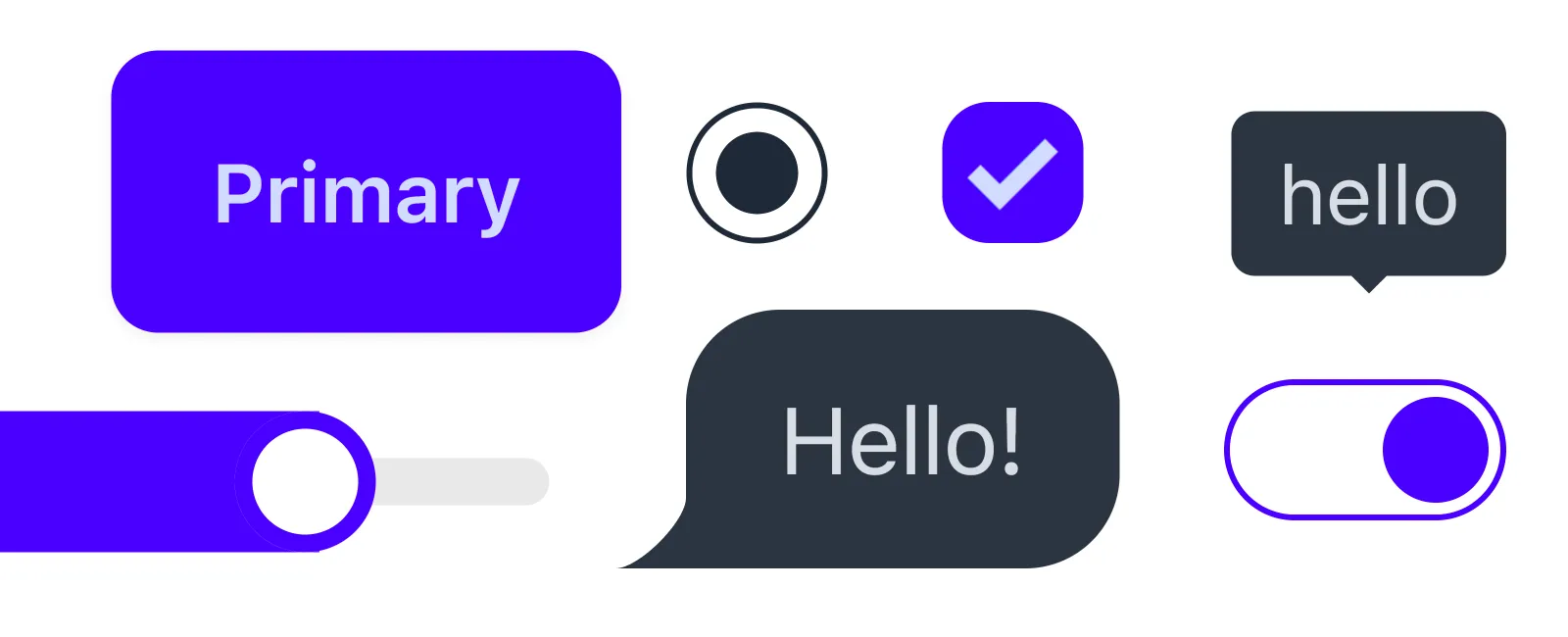
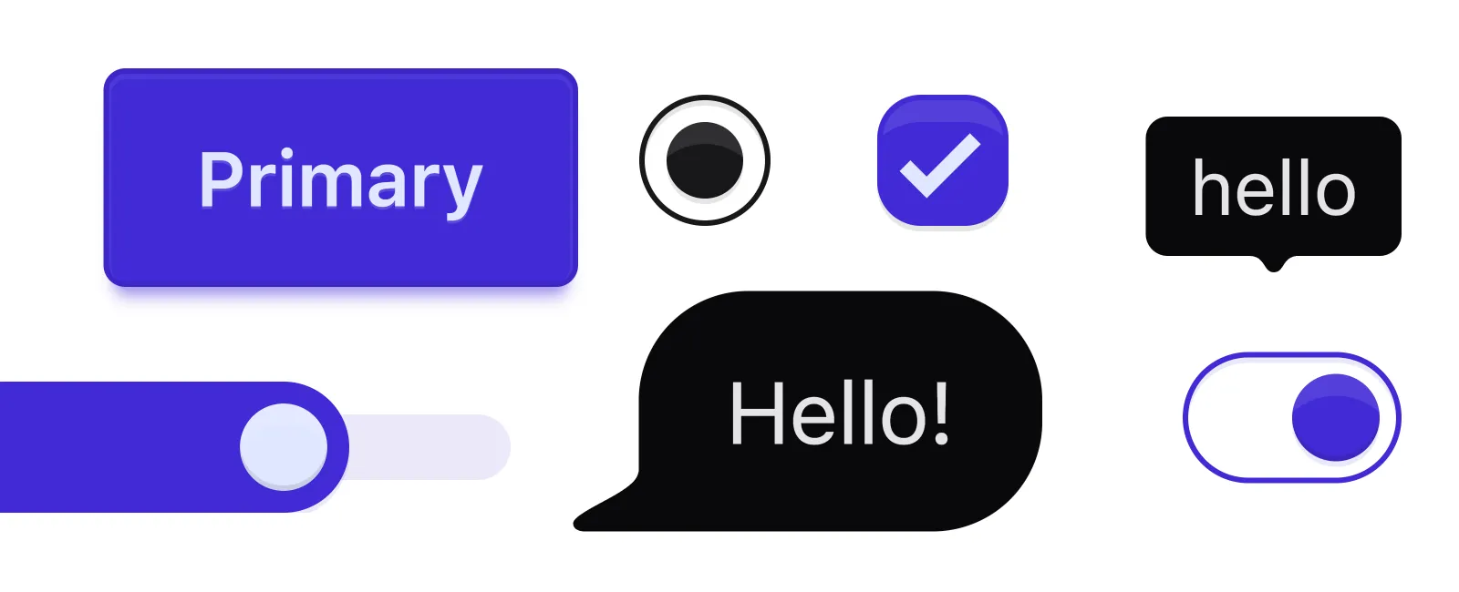
Some components have improved visual appeal.
Skip to the next section
- Alert – New soft/dash styles, new vertical/horizontal layout options
- Badge – New soft/dash styles
- Button – New hover behavior for ghost/outline styles, new soft/dash styles
- Card – New radio card functionality, new dash variant
- Checkbox – New design, accessibility improvements
- Countdown – Accessibility improvements
- Diff – Better iOS Safari support, improved Firefox performance, accessibility improvements
- Dock (formerly bottom-navigation) – New design, accessibility improvements
- Drawer – Improved accessibility
- Dropdown – Popover API, Anchor Positioning, new dropdown-center modifier, accessibility improvements, clicking the button will toggle the dropdown if it's open.
- Footer – New horizontal/vertical layout options
- Join – Improved structure compatibility
- Modal – New positioning options (modal-start, modal-end, modal-top), accessibility improvements
- Radio – New design, accessibility improvements
- Radial Progress – accessibility improvements
- Rating – accessibility improvements
- Stack – New CSS grid layout, new directional options
- Steps – Ability to add custom icon, accessibility improvements
- Tab – New tabs-border style, new top/bottom positioning, accessibility improvements
- Timeline – Accessibility improvements
- Toggle – New custom icons support, accessibility improvements
- Tooltip – New tooltip-content class
7. Component design improvements
TLDR – Several components received visual enhancements for improved aesthetics.
Skip to the next section
These components have been improved to be more visually appealing:
- Chat bubble
- Checkbox
- Radio
- Toggle
- Range
- Menu
- File Input
- Select
- Input field
- Label
- Rating
- Radial Progress
- Mockups
8. Component size scale improvements
TLDR – Size scale improvements for better consistency and flexibility.
Skip to the next section
These components now support the new xl size modifier:
- Button
- Card
- Kbd
- Table
- Menu
- Tab
- Loading
- Checkbox
- File Input
- Radio
- Range
- Rating
- Select
- Input field
- Textarea
- Toggle
Size scale of these components has been improved to be more consistent:

9. Detailed Changelog
TLDR - It's a long list of changes. Most of them won't affect you, so I've summarized the most important ones here and you can read the detailed changelog for each component in the changelog page.
Skip to the next section
Summary of changes:
- Visual style updates.
- Size adjustments.
- Accessibility improvements.
- Bug fixes.
- New features and more customization options.
- Structure changes for a few parts of component.
- Responsive design improved.
- Print-friendly styles for many components.
- Some classes were renamed, some unused ones were removed (Read next section for details).
Read the detailed changelog for each component
10. Breaking changes in class names
TLDR - Some class names were renamed, some unused ones were removed.
Skip to the next section
- Add
md:footer-horizontaltofootercomponent to make it horizontal on medium screens. - Instead of
btn-groupusejoin(btn-groupwas deprecated in 2023, now removed) - Instead of
input-groupusejoin(input-groupwas deprecated in 2023, now removed) - Rename
card-compacttocard-sm - Rename
disabledclass ofmenuitems tomenu-disabled. - Rename
activeclass ofmenuitems tomenu-active. - Rename
focusclass ofmenuitems tomenu-focus. - Delete
form-controlclass. Use the newfieldsetcomponent instead. - Instead of previous
labelsyntax, use the newlabelsyntax. - Rename
btm-navtodock. - Rename
btm-nav-labeltodock-label. - Rename
btm-nav-xstodock-xs. - Rename
btm-nav-smtodock-sm. - Rename
btm-nav-mdtodock-md. - Rename
btm-nav-lgtodock-lg. - Instead of
artboardclass, use Tailwind CSS width/height utilities. - Delete
artboard-demo,artboard-horizontal,phone-*classes. Use Tailwind CSS width and height utilities instead. - Rename
onlineclass ofavatartoavatar-online. - Rename
offlineclass ofavatartoavatar-offline. - Rename
placeholderclass ofavatartoavatar-placeholder. - Delete
mask-parallelogram. No longer exists. - Delete
mask-parallelogram-2. No longer exists. - Delete
mask-parallelogram-3. No longer exists. - Delete
mask-parallelogram-4. No longer exists. - Delete width/height of items inside the
stack, use width/height for thestackitself.
Read the detailed changelog for each component
11. Breaking changes in design system
Default sizes for some UI elements have been adjusted for improved consistency. They are also customizable now.
Skip to the next section
btn,input,selectnow have a smaller height by default see size scale improvementscheckbox,radio,toggle,range,ratingnow have a smaller height by default see size scale improvements
You can customize the default size scale using the new --size-field and --size-selector CSS variables in your theme.
Check out the new Theme Generator page to see it in action.
Read the detailed changelog for each component
12. Breaking changes in config
TLDR – Use the new config format in the CSS file. No need for
tailwind.config.jsanymore.
The new config format is easier to use, it's more flexible, and it's more powerful.
Skip to the next section
- Tailwind CSS 4 allows config directly from the CSS file, so instead of
tailwind.config.jsyou need to put the daisyUI config in the CSS file. See the new config format. themesconfig is a comma separated list of theme names. Read more about daisyUI config and daisyUI themes.darkThemeconfig was removed. Instead you can use--prefersdarkflag directly in thethemeslist.themeRootconfig was renamed toroot.styled: falseconfig was removed in favor of providing micro CSS files and the ability to include/exclude parts of the library. Disabling themes will remove all colors, but component are no longer distributed into two chunk of unstyled styled. You can now include/exclude each component individually.base: falseconfig was removed in favor of include/exclude config where you can include/exclude each component individually.utils: falseconfig was removed in favor of include/exclude config where you can include/exclude each component individually.
Read more about daisyUI config.
13. Breaking changes in themes
TLDR – Automatic
*-contentcolor calculation is removed. Theme variable names have changed for better consistency and readability. Previous themes are available for easy migration.
Skip to the next section
Automatic *-content color calculation based on background color was removed. Now that Tailwind CSS supports CSS variables for colors, we no longer process and convert color values at build time. You can use any color format you want and neither daisyUI nor Tailwind CSS will convert it to another format at build time.
Most themes have been adjusted to look better and consistent. color contrast and accessibility got even better and the colors are more harmonious. These changes make the color more visually appealing and easier to read.
If you prefer using the previous colors, I prepared a repo, including all daisyUI 4 theme colors easy to copy/paste in daisyUI 5.
All color variable names have been changed to be aligned with new Tailwind CSS 4 syntax. And to be more readable and easier to customize See the new color format
| Before | After |
|---|---|
--p | --color-primary |
--pc | --color-primary-content |
--s | --color-secondary |
--sc | --color-secondary-content |
--a | --color-accent |
--ac | --color-accent-content |
--n | --color-neutral |
--nc | --color-neutral-content |
--b1 | --color-base-100 |
--b2 | --color-base-200 |
--b3 | --color-base-300 |
--bc | --color-base-content |
--in | --color-info |
--inc | --color-info-content |
--su | --color-success |
--suc | --color-success-content |
--wa | --color-warning |
--wac | --color-warning-content |
--er | --color-error |
--erc | --color-error-content |
--rounded-box | --radius-box |
--rounded-btn and --tab-radius | --radius-field |
--rounded-badge | --radius-selector |
--border-btn and --tab-border | --border |
Removed theme variables
--animation-btnwas removed (no longer needed)--animation-inputwas removed (no longer needed)--btn-focus-scalewas removed (no longer needed)
Theme custom fonts
Cyberpunk and Wireframe themes no longer have custom font by default. If you want the same v4 font for them, customize these themes like:
@plugin "daisyui";

@plugin "daisyui/theme" {
  name: cyberpunk;
  font-family:
    ui-monospace,
    SFMono-Regular,
    Menlo,
    Monaco,
    Consolas,
    Liberation Mono,
    Courier New,
    monospace;
}

@plugin "daisyui/theme" {
  name: wireframe;
  font-family:
    Chalkboard,
    comic sans ms,
    "sans-serif";
}
14. Bug fixes
TLDR – More than 95% of all the open issues from daisyUI 4 have been fixed in this release.
Skip to the next section
Some of these bugs were fixed automatically by the new changes in changes in the core library, design system, themes, and components. Some of them became possible with the new capabilities of Tailwind CSS 4.
And some of these bugs were related to a specific structure / style / behavior of components and changing them in a patch release would have caused breaking changes for all existing projects. We had to wait for the major release to apply these changes.
If you've been waiting for a specific bug fix, here are the bugs that have been fixed in this release. Let me know if I miss any bug or let me know if a bug is closed by mistake 💚
- #3558: bug: (v5) label style not applying properly when using responsive breakpoints
- #3556: bug: Responsive tooltip appearance
- #3551: bug: Color utility classes missing from v5 CDN
- #3547: bug: placeholder ignored when using floating labels
- #3544: bug: Radius not working when using the prefix
- #3542: docs: Duplicate classes
- #3531: bug: List component has alternating columns grow with list-col-grow
- #3530: docs: Some examples uses class= instead of clasName= in JSX
- #3529: bug: Some examples uses class= instead of clasName= in JSX
- #3527: docs: v5 theme generator on invalid color input breaks site
- #3524: bug: css-syntax-error daisyUI 5.0.0-beta.8 Error when minifying CSS, results in malformed styles / Vite build errors. NUXT/Vite
- #3520: bug: (v5) Cally date picker - month switcher icons are the incorrect colour when used as popover
- #3519: bug: (v5) Date, time, and datetime inputs aren't styled correctly in Safari
- #3518: docs: (v5) Navbar component misspell class keyword on JSX snippet
- #3517: bug: Inconsistent padding for .card-md
- #3508: bug: Responsive join always vertical (with CDN usage)
- #3482: bug: v5 with a prefix does not override tailwind typography correctly
- #3473: bug: (v5) File input doesn't have a background by default while plain input does
- #3472: bug: nuxt + daisyui / build = WARN vite:css postcss Parse error on line 1: --radius-selector) + var(--radius-selector) + var(--radius-selector)))
- #3468: bug: (v5) react-day-picker unusable inside a dropdown
- #3453: bug: vite warnings when minifying css
- #3451: bug: filter component not hiding other radio button choices
- #3443: bug: (v5) accordion focus doesn't work
- #3440: bug: V5 Dialog does not put focus on first focusable element
- #3433: bug: .list-row specificity is too high
- #3432: bug: Tables with one row have unnecessary underline
- #3430: bug: v5 beta3 CDN Styling issues
- #3427: docs: Error alerts have a css typo
- #3421: bug: dividers have a default margin-inline that can't be overridden
- #3418: docs: Typo on https://v5.daisyui.com/components/stack/ page
- #3417: docs: (v5)
<svg>className error - #3394: bug: V5 Floating label + validator causes placeholder text to be off centered
- #3391: bug: V5 Options in select elements with a label do not respect dark mode
- #3389: bug: V5 (via CDN) Colors modifier for Chat bubble not working
- #3383: bug: V5 Dock Component / The active large size overlaps the line.
- #3382: bug: Dropdown does not close in an intuitive way
- #3381: bug: V5 - Using a Floating Label with a disabled input looks weird.
- #3375: bug: v5 hover:swap-active produces unwanted behavior
- #3360: bug: The label for the select element is not displayed in a single line but is instead stacked in a multi-language environment.
- #3348: docs: tsx code for method 2 (popover api) of dropdown
- #3346: bug: Tooltip does not shown under overflow
- #3332: bug: v5 Label with select has non-working drop down arrow
- #3328: bug: setting width to an
<input>element doesn't shrink the<input>element - #3325: bug: TS type declaration missing for themes/object
- #3322: bug: V5 Dropdown mispositioning using popover API and anchorpositioning
- #3320: bug: V5-alpha48 toggle misplaced in Firefox
- #3318: bug: Timeline Spacing
- #3316: bug: V5 glass does not work
- #3315: bug: Tab (legacy) visual pop when radio inputs are unchecked
- #3313: docs: daisyUI v5 default theme
- #3312: docs: daisyUI V5 themes color extraction
- #3308: bug: Rating unchecked displays all as checked
- #3294: bug: (v5) dropdown displayed in viewport top left corner in Firefox
- #3287: docs: JSX Example Code of Select Causing Warning in React
- #3285: bug: the background of btn-disabled (or disabled btn) should be transparent if combined with btn-ghost
- #3281: bug: (v5): Select: does not wrap content with h-fit
- #3280: bug: (v5) Button: btn-ghost does not allow combine with text color
- #3276: bug: dropdown-hover do not work on laptops with a touchscreen
- #3272: bug: themes that change the default font conflicts with the ones that does not.
- #3250: bug: tailwindcss neutral color compatibility with theme()
- #3245: bug: daisyUI 5 doesn't override @tailwindcss/typography style of
<code>element, leading to unreadable text. - #3242: bug: daisyUI 5: select is not wide enough, resulting in the select arrow overlapping with content
- #3232: bug: Some elements depend on using backgrounds, which break for print media
- #3231: bug: Diff component not working in Astro, Nextjs
- #3224: bug: mb-* override by timeline-compact when used with timeline-start but not timeline-end
- #3222: bug: invisible toast area blocks buttons
- #3218: bug: 'join-vertical md:join-horizontal' failed to set horizontal style border on nest join-item
- #3216: bug: btn btn-link btn-disabled looks like button but not link
- #3215: bug: Vertical scroll not functional when drawer is open on screens under 1024px width
- #3203: bug: Browser mockup component's search icon is broken in Safari
- #3202: bug: Non-animated buttons behave strangely when active in Firefox
- #3188: bug: menu item modifier not works with selector
- #3176: bug: range in rtl mode show wrong bar
- #3170: bug: Invalid CSS generated when child of an element with the "btm-nav" class has the "active" class that...
- #3169: docs: position Drawer component seem not working
- #3267: bug: Carousel not working properly in chrome
- #3166: bug: scrollbar-color causing unnecessary repaints
- #3160: docs: Navigation does not work due to call to navigator.sendBeacon()
- #3157: bug: Chat bubble visibly split with white line
- #3155: docs: Modal that closes when clicked outside
- #3153: Weird behaviour when buttons include HTML elements (seen when adding the v3/4 loading spinner spans)
- #3148: bug: Diff component not working on Firefox.
- #3141: bug: dropdown breaks in tables with overflow applied
- #3128: bug: collapse with arrow or plus crashes edge
- #3117: bug: Media breakpoint doesn't seem to apply with menu-horizontal
- #3116: bug: Nesting Collapse in Dropdown menu results in unintended Dropdown behaviour
- #3078: bug: tabpanel on the real device does not fill full width.
- #3071: bug: White area overlays part of the drawer's content
- #3060: bug: stepper (active step) z-index is higher then of the drawer
- #3053: bug: Lagging on the opening animation of collapse components only on Firefox
- #3040: bug: Modal Dialog Adds A None Existent Scrollbar Spacing To Backdrop
- #3027: bug: tabs boxed with radio forces unrounded bottom corners
- #2988: bug: Tabs using grid-span: 9999
- #2987: bug: The theme color is incorrect in yarn serve mode after Docusaurus is built
- #2979: bug: menu-horizontal submenus styled differently when using menu-dropdown vs details
- #2975: bug: btn doesn't accept --fallback tokens as first option.
- #2965: bug: The .collapse-content and .collapse-title extend beyond the width of the .collapse elementi itself
- #2950: docs: Inaccessible components / wrong advice on docs.
- #2867: bug: Sidebar-drawer component overlay does not overlay table pinned rows
- #2865: bug: Disabled inputs and buttons have inconsistent styling
- #2862: bug: long string in menu does not wrap in safari (with temp solution)
- #2850: bug: Broken transition on collapse when using Firefox (macOS)
- #2833: bug: diff adjusting doesn't work on Firefox for Android
- #2802: bug: table has relative position causing issues
- #2800: bug: Long tab names are squished
- #2796: bug: custom background color of button at file input
- #2735: bug: Tab content width on Safari
- #2734: bug: CDN installation does not recognize submit button
- #2725: bug: Collapse with icon, Arrow is jumping but plus/minus icon seems ok
- #2689: bug: Hover styles are not working on Firefox (Windows & Android)
- #2684: bug: diff dragging does not keep up with mouse, !chrome
- #2678: bug: Tab text wrap with large content
- #2669: bug: "Important" setting from tailwind is not followed
- #2667: bug: Modal with responsive on small screen with animation jitter
- #2653: bug: Wrong inferred type when importing daisyUI
- #2643: bug: Tab in boxed mode source their colors on --p/--pc instead of --tab-bg/--tab-border-color
- #2637: bug: navbar do not get invisible in firefox
- #2626: bug: Submenu Display is not correct on Firefox and Safari
- #2619: bug: Skeleton not visible enough under dark themes
- #2615: bug: Accordion not animating height
- #2605: bug: Non join-item sibling affects last join-item
- #2597: docs: Theme Generator ignore theme
- #2571: bug: Dropdown affects height while hidden
- #2570: bug: Loading spinner on Safari
- #2564: bug: accordions and collapses don't open in safari 15.1
- #2502: bug: Dialog-type modals dont fade in the background tint.
- #2442: bug: Carousel buttons not functioning
- #2415: bug: columns overlap on pinned column with rowspan, & only the first and last
<th>tags get pinned - #2413: bug: Joins cannot be nested
- #2410: bug: wrong chat bubble spacing in Safari when inside a column flex box
- #2375: bug: Bottom navigation scroll problem in chorme (IOS)
- #2296: bug: multiple dialog crashes the page
- #2223: bug:
<dialog>element items are focusable, even when<dialog>element is closed - #2172: bug: Accordion crashes using checkboxes inside collapse-content
- #2137: bug: Accordion. Content is jumping down and up
- #2115: bug: Dropdown inside join is not rounded
- #1929: bug: v3 Join Buttons overlap when clicked
- #1922: bug: option with 'disabled' and 'selected' attributes have a weird behavior on Chromium-based browser
- #1831: bug: gap in tooltip arrow
- #1744: bug: Aliasing issues for Radial progress
- #1732: bug: Bad placement of the buttons in the bottom-navigation in iOS PWA mode
- #1672: bug: All component's CSS ends up in build output?
- #865: Docs Reset theme generator values respectively
- #694: Bug: Website theme generator keeps text formatting on paste documentation

Please report any new bugs you find to GitHub issues 🙏
15. Get started with daisyUI 5

1 - Tailwind CSS 4 upgrade guide
2 - daisyUI 5 upgrade guide
If you found any issue, report on the GitHub issues page so we can fix them.
Join us at daisyUI Discord server to get the news and updates about the final release or talk about daisyUI with other developers.