Updates, ideas and resources

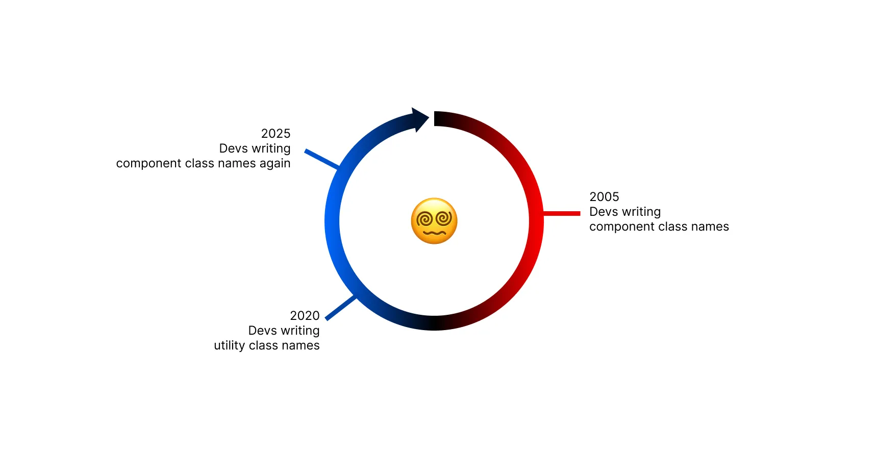
Not going full circle with class names
"Are we going full circle?" This is one of the questions I get asked about when people see component class names and utility classes together.
For small projects, it may not be critical how to organize your CSS. However, as projects grow in size and complexity, having a clear strategy for managing styles becomes life-saving. You may have worked on large projects with lots of components with different styling needs, and found yourself struggling on how to manage your CSS in a way that is maintainable and scalable at the same time.
How do we organize CSS at scale?
When structuring your components and their styles, there are 3 common approaches:
1. Component Classes: Speed and Reusability
The first approach is using component classes, which are predefined classes for common UI elements like buttons, cards, or modals. These class names are semantic and reusable, designed to represent the role of the element rather than its specific content. For example, you might use a class like .btn instead of .signup-button, or .card instead of .product-showcase.
This abstraction allows you to reuse the same class across multiple parts of your application, ensuring consistency and reducing redundancy. Component classes excel at speeding up development by providing ready-to-use building blocks for your UI. However, they can become limiting when you need specific customizations that don't fit the predefined design, often requiring you to write additional CSS overrides or create entirely new component variants.
2. Utility Classes: Low-level Control and Flexibility
The second approach involves utility classes, which are low-level classes that map directly to individual CSS properties, such as margin, padding, or color. These classes, like p-4 for padding or text-blue-500 for text color, give you granular control over your styles.
Utility classes are highly flexible and allow for precise customization without the need to write additional CSS. This approach is particularly powerful when you want to fine-tune your designs or create unique layouts, as it enables you to compose styles directly in your HTML. However, this flexibility comes at the cost of development speed—you need to write many class names for each element, which can make your HTML verbose and slow to write.
3. Context-Based Styling: Total Isolation
The third approach is context-based styling, where styles are defined based on the specific context in which they are used. This includes techniques like CSS Modules (like signupForm.module.css imported into a single <SignupForm> JS component) or context-specific classes (like .signup-form or .signup-input) that are used only in one specific place.
The goal of this isolation was to prevent a common problem: changing styles in one part of your application accidentally breaking styles somewhere else. By creating completely isolated styles for each component or context, you can guarantee that changes won't have unintended side effects.
However, this approach often leads to significant challenges. Creating new styles for every context results in duplicate styles—you end up writing the same button styles, spacing rules, and color definitions multiple times across different files. This makes your codebase harder to manage and creates inconsistencies as these duplicated styles drift apart over time. Ironically, the problem this method tries to solve wouldn't exist with proper CSS architecture and modern features like CSS Cascade Layers.
Is this a chronological evolution?
People who remember the Bootstrap era look at component class names like btn, card, and modal and wonder if we're repeating history.
It's a good question that shows how we think about front-end development progress.
The answer is in understanding what happened with each approach, and why what we have today wasn't possible before.
Components only: Fast development, hard customization
Bootstrap and similar frameworks gave us component classes like btn, card, and navbar. These were great for development speed. You could build a website quickly by just adding class names.
But customization was hard. If you wanted to change colors, spacing, or design details, you had to override CSS styles. This was time-consuming and messy. Most Bootstrap websites ended up looking the same because customizing was such a pain.
Utility first: Easy customization, slow development
Tailwind CSS came with utility classes for every CSS property. Want a different border radius? Use rounded-lg. Different colors? Use bg-blue-500. Want custom spacing? Use px-4 py-2.
Customization became easy. You had complete control over every detail without writing custom CSS or fighting framework styles.
But development became slow. Look at this button made with utility classes:
<button
  class="inline-flex items-center justify-center rounded-md border border-transparent bg-indigo-600 px-4 py-2 text-sm font-medium text-white shadow-sm hover:bg-indigo-700 focus:ring-2 focus:ring-indigo-500 focus:ring-offset-2 focus:outline-none disabled:cursor-not-allowed disabled:opacity-50"
>
  Button
</button>
You need to write all these class names every time you want a button. It's slow to write and hard to maintain. Your HTML files become bloated with class names.
We need both: Fast development AND easy customization
Here's what we really need: the fast development of component classes combined with the easy customization of utility classes.
This is what daisyUI gives you. Component classes for speed, utility classes for customization, working together.
With daisyUI, you get the same button like this:
<button class="btn btn-primary">Button</button>Clean, readable, fast to write. And you can customize it easily by adding utility classes without any problems.
Want it larger? Add btn-lg. Want different colors? Use bg-blue-500. Want custom spacing? Add px-8. Want rounded corners? Add rounded-xl.
<button class="btn btn-primary rounded-xl bg-blue-500 px-8">Custom Button</button>You get both fast development and easy customization in the same workflow.
How this works at scale?
In real projects, you use both approaches where they make sense:
- 90% of your UI uses standard patterns like buttons, cards, inputs, navigation. Component classes are perfect for these.
- 10% of your UI needs custom touches like specific spacing, unique colors, special layouts. Utility classes handle these perfectly.
This gives you both fast development and easy customization in the same workflow.
Why a component library on top of Tailwind CSS?
You might wonder: why build a component library on top of Tailwind CSS specifically? Why not a library with component classes and utility classes from scratch?
The answer is in how atomic design works.
Think of Tailwind CSS utility classes as atoms - the smallest building blocks. Classes like p-4, bg-blue-500, rounded-lg are individual CSS properties that you can combine.
daisyUI components are like molecules - bigger pieces made from these atoms. A btn component combines padding, background, border, text styles, and hover states. A card component combines background, shadow, padding, and border radius.
When both the atoms (utilities) and molecules (components) are part of the same system, we get something powerful: Consistency in design tokens and visual harmony. It's crucial that you can customize everything and Tailwind CSS is great at this. It's also important that we can quickly add UI parts without worrying about details, and we want both of these to happen seamlessly. Yes, a component library can bring its own utility classes (Like Bootstrap, MUI, or even Radix did) but they can't compete with Tailwind CSS at customizability since Tailwind CSS simply provides utiltiy classes for every single CSS property you would need!
This is why you can write btn bg-red-500 px-8 and everything works perfectly. The component and utilities speak the same language because they're built on the same foundation.
Not a Full Circle, a Full Spectrum!
❌ Instead of thinking about this as going full circle like this
✅ It's better to see it as a spectrum like this
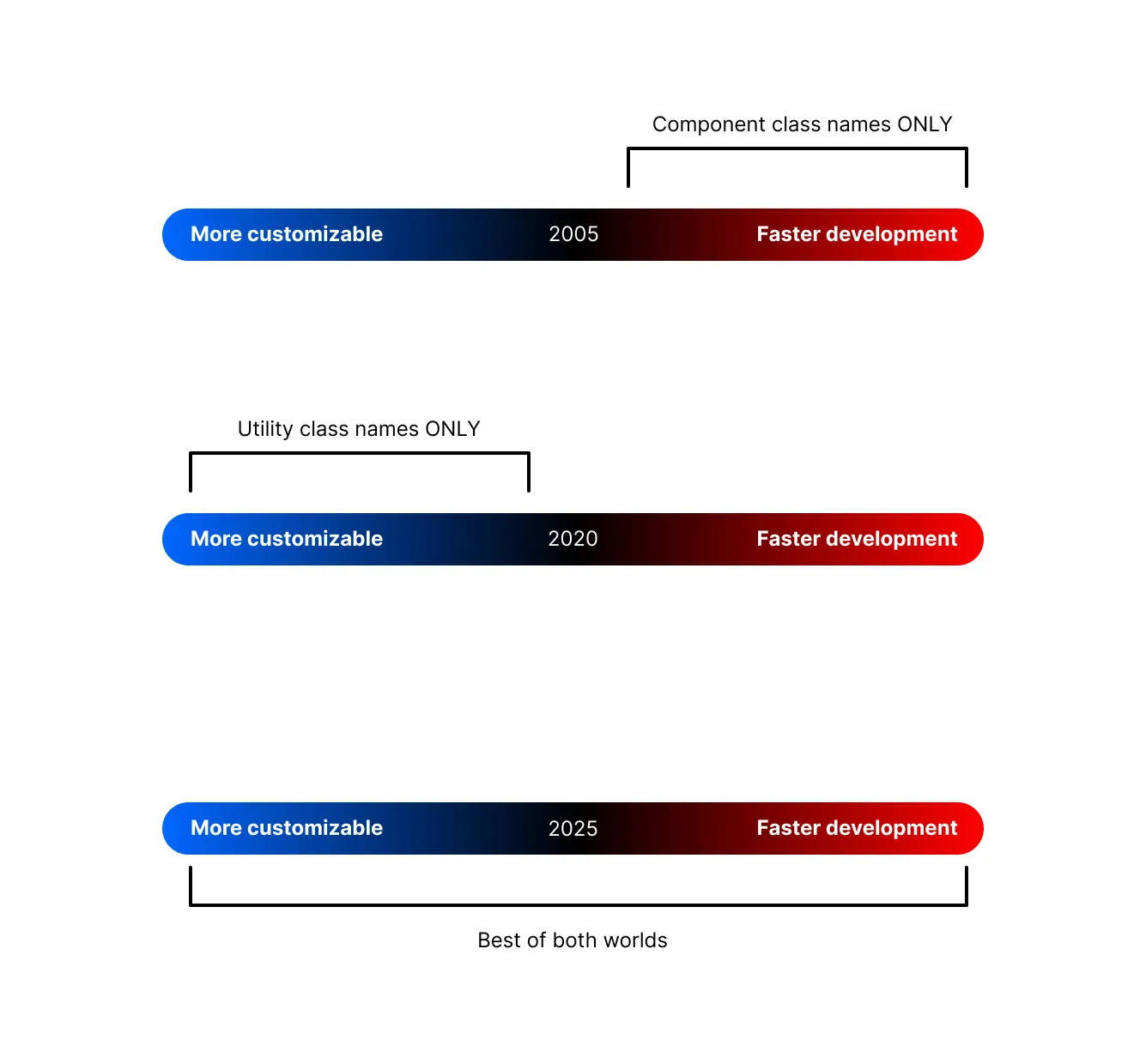
where you can get the benefits of both approaches:
🤔 Bootstrap: Fast development, hard customization.
🤔 Utility-only Tailwind CSS: Easy customization, slow development.
😍 daisyUI: Fast development AND easy customization.
It's best of both worlds!