Updates, ideas and resources
Introducing: Documentation template for Astro and daisyUI
Learn to build professional documentation quickly with the Documentation Template for Astro from daisyUI.
Introduction
Creating user-friendly documentation is essential for any project, but it doesn’t have to be complicated. With the "Documentation Template for Astro" available at Official daisyUI store, you can quickly build beautiful and easy-to-navigate documentation for your product or project. A Next.js version of the template is also available if you prefer using Next.js. This guide will walk you through installing, customizing, and deploying your documentation site using the Astro template.
1. How to Install the Documentation Template
To get started, purchase and download the Documentation Template from the daisyUI store. After downloading, follow these steps:
Install Dependencies
Navigate to your project directory and install the necessary dependencies:
Install Dependencies
npm installRun the Development Server
npm run dev
2. How to Customize the Content
This template comes with a customizable landing page (home page) and a dedicated documentation page. While our focus will be on the documentation page, we’ll also briefly explain how to customize the landing page.
1. Customizing the Landing Page
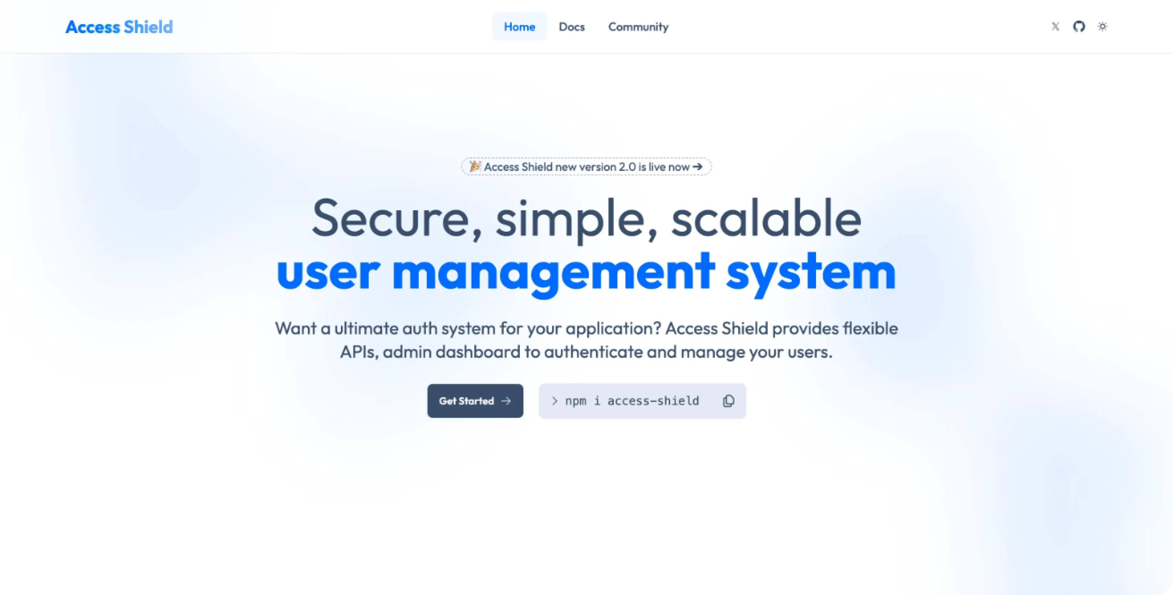
The landing page is the first thing visitors see, so it’s essential to make it visually appealing and informative. Here’s a quick guide on how to customize it:
Navigate to src/pages/index.astro:
This file controls the layout and content of the landing page. You can adjust the hero section, call-to-action buttons, featured content, and more.
---
import CodeBlock from "../components/home/CodeBlock.astro";
import Features from "../components/home/Features.astro";
import Hero from "../components/home/Hero.astro";
import Integration from "../components/home/Integration.astro";
import Contributors from "../components/home/Contributors.astro";
import Testimonial from "../components/home/Testimonial.astro";
---

<script>
  import Translate from "$components/Translate.svelte"
</script>

<div>
  <Hero />
  <Features />
  <CodeBlock />
  <Integration />
  <Contributors />
  <Testimonial />
</div>
Modify the imported components (Hero, Features, etc.) to fit your branding and content needs.
2. Customizing the Documentation Page
Personalizing the documentation page is straightforward. Here’s how you can customize key sections:
1. Changing the Header
Navigate to src/components/docs/DocsHeader.astro:
This file contains your Header section information. Here, you can modify the searchbar, social links and theme toggle.
<header class="sticky top-0 z-30">
  <nav class="navbar bg-base-100/90 shadow-sm backdrop-blur-lg justify-center items-center py-2 md:px-10 px-2 border-b border-base-content/10">
    <div class="navbar-start">
      <label for="my-drawer-2" class="btn btn-square btn-ghost lg:hidden">
        <svg
          xmlns="http://www.w3.org/2000/svg"
          fill="none"
          viewBox="0 0 24 24"
          class="inline-block w-5 h-5 stroke-current"
        >
          <path
            stroke-linecap="round"
            stroke-linejoin="round"
            stroke-width="2"
            d="M4 6h16M4 12h16M4 18h16"
          ></path>
        </svg>
      </label>
    </div>

    <div class="navbar-end">
      <a
        class="btn btn-sm btn-ghost"
        href="https://www.x.com"
        aria-label="twitter"
      >
        <svg viewBox="0 0 24 24" aria-hidden="true" class="h-4 w-4">
          <path
            d="M13.3174 10.7749L19.1457 4H17.7646L12.7039 9.88256L8.66193 4H4L10.1122 12.8955L4 20H5.38119L10.7254 13.7878L14.994 20H19.656L13.3171 10.7749H13.3174ZM11.4257 12.9738L10.8064 12.0881L5.87886 5.03974H8.00029L11.9769 10.728L12.5962 11.6137L17.7652 19.0075H15.6438L11.4257 12.9742V12.9738Z"
            fill="currentColor"
          ></path>
        </svg>
      </a>
      <ThemeToggle />
    </div>
  </nav>
</header>
2. Updating the Sidebar Navigation
Navigate to src/components/docs/SideBar.astro:
The sidebar is where your documentation sections are listed. Update it to add, remove, or modify sections:
<div class="drawer-side z-40 md:border-r md:border-base-content/10">
  <label
    for="my-drawer-2"
    aria-label="close sidebar"
    class="drawer-overlay"
  ></label>
  <aside class="bg-base-100 min-h-screen w-80">
    <div
      class="bg-base-100/90 sticky top-0 z-20 items-center gap-2 px-4 py-2 backdrop-blur lg:flex"
    >
      <a href="/" class="flex-0 btn btn-ghost px-2">
        <h1
          class="text-2xl font-bold bg-clip-text text-transparent bg-linear-to-r from-primary to-primary/50"
        >
          Access Shield{" "}
          <span class="text-sm text-base-content opacity-50">docs</span>
        </h1>
      </a>
    </div>
  </aside>

  <!-- SideBar Code -->
</div>
3. How to Add New Content
Adding new content pages to your documentation is simple:
- Create a New Markdown File
Navigate to the src/content/docs directory and create a new .mdx file. For example:
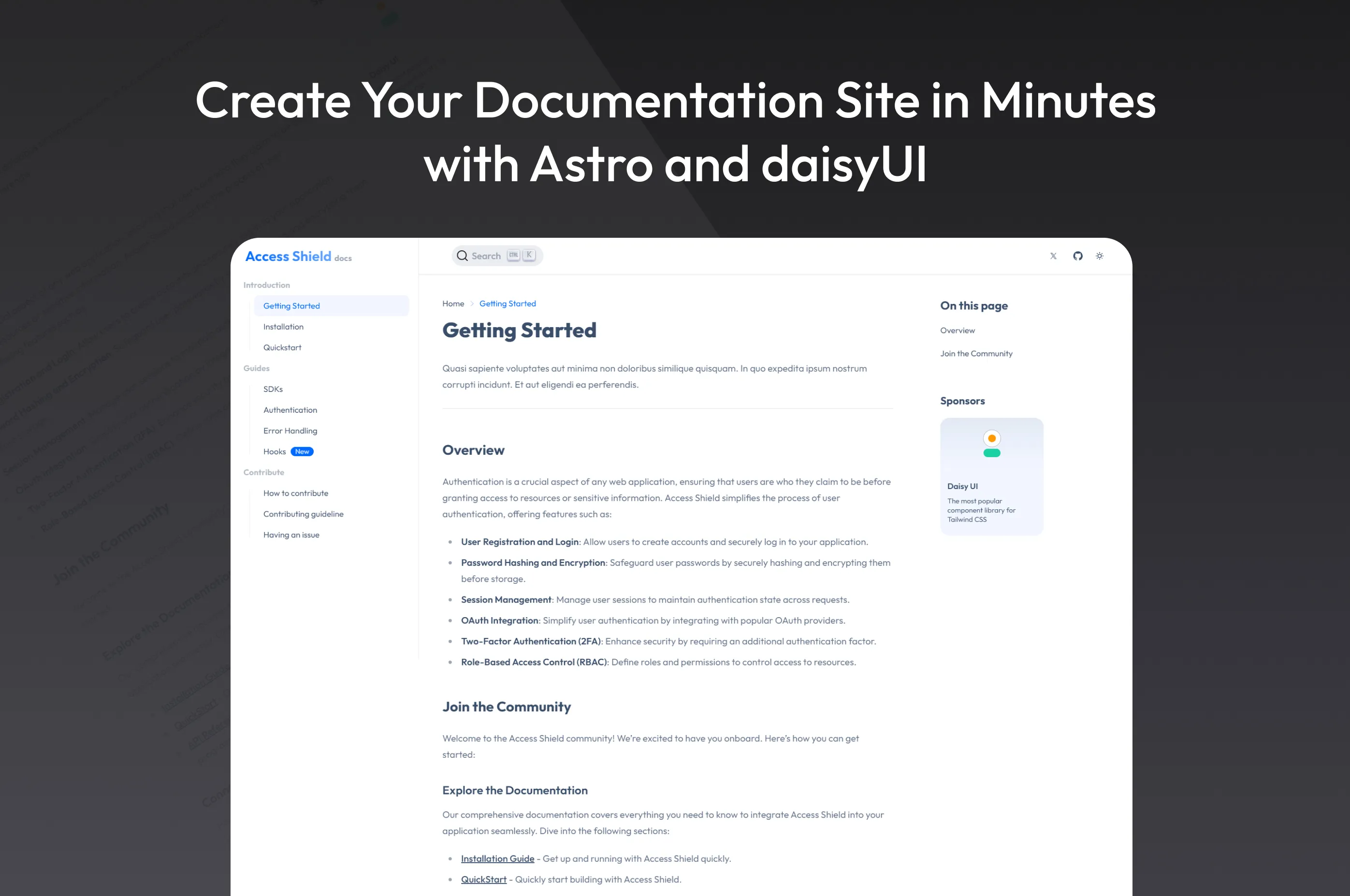
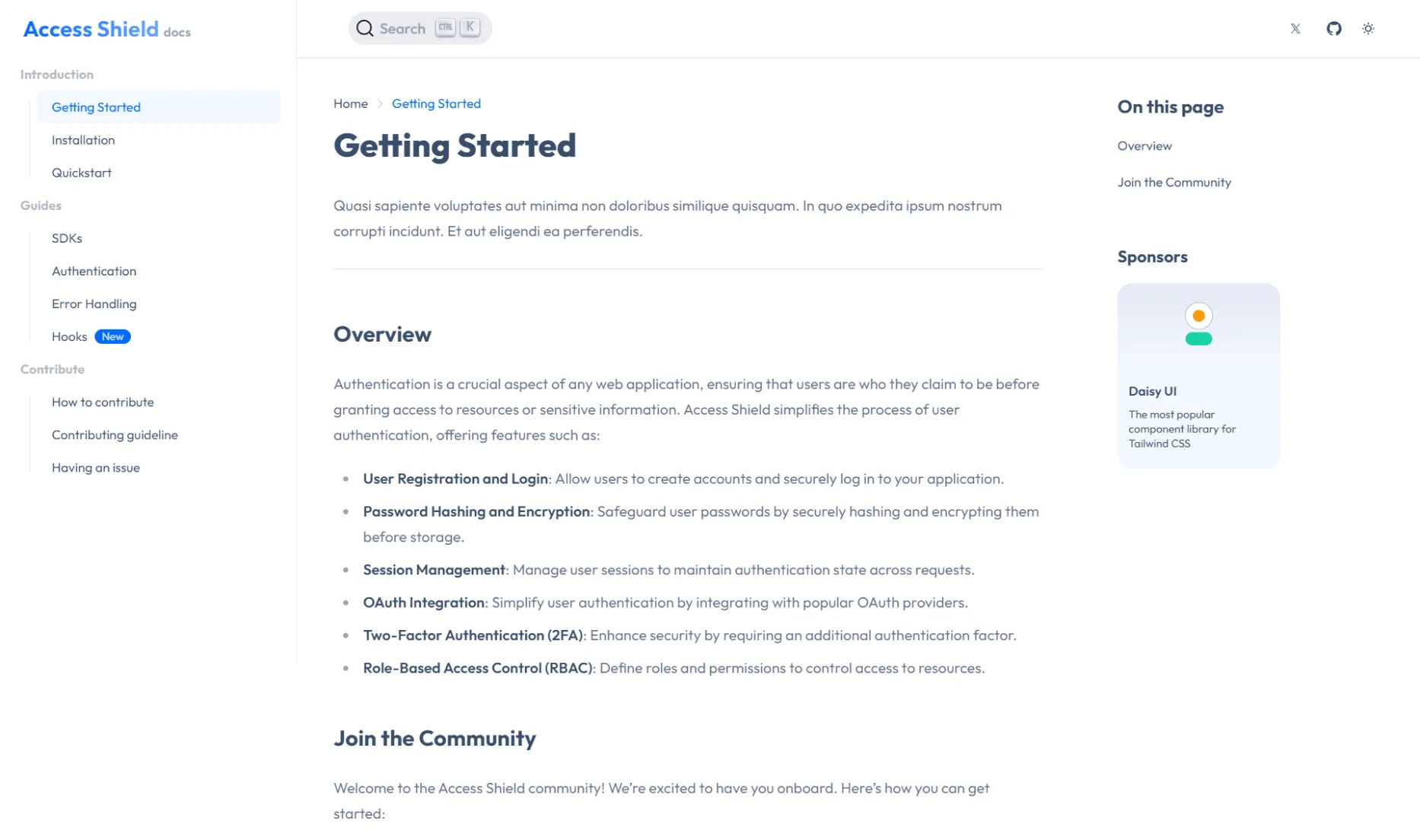
src/content/docs/gettingstarted.mdx- Write Your Content
Open the new file and add your content using Markdown. Here's a basic structure:
---
title: Getting Started
description: "Quasi sapiente voluptates aut minima non doloribus similique quisquam. In quo expedita ipsum nostrum corrupti incidunt. Et aut eligendi ea perferendis."
---
<script>
import Translate from "$components/Translate.svelte"
</script>
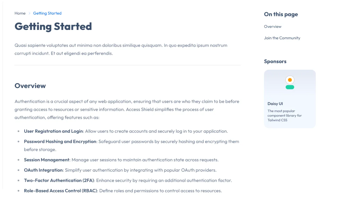
## Overview
Authentication is a crucial aspect of any web application, ensuring that users are who they claim to be before granting access to resources or sensitive information. Access Shield simplifies the process of user authentication, offering features such as:
- **User Registration and Login**: Allow users to create accounts and securely log in to your application.
- **Password Hashing and Encryption**: Safeguard user passwords by securely hashing and encrypting them before storage.
- **Session Management**: Manage user sessions to maintain authentication state across requests.
- **OAuth Integration**: Simplify user authentication by integrating with popular OAuth providers.
- **Two-Factor Authentication (2FA)**: Enhance security by requiring an additional authentication factor.
- **Role-Based Access Control (RBAC)**: Define roles and permissions to control access to resources.- Preview Your Changes
Save the file and run the development server (npm run dev) to see your new page in the documentation site.
4. How to Build the Template for Production
When you're ready to go live, build your documentation site for production:
npm run buildThis command will optimize and generate your site’s static assets, ready for deployment.
5. Deployment Options
Deploying your documentation site is easy with the following options:
Conclusion
With the "Documentation Template for Astro" from daisyUI, creating clean and easy-to-use documentation is quick and straightforward. Just follow these steps, and you'll have your site up and running in no time. Visit the daisyUI store to get started!.